Apartment layout
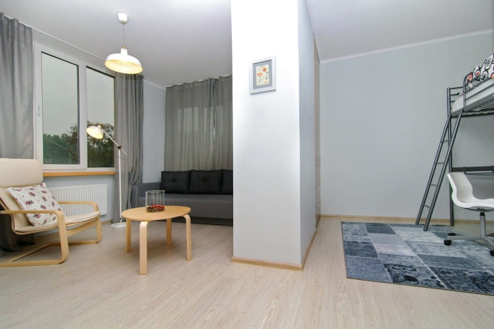
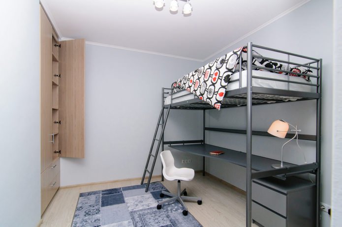
Designers have provided all the areas necessary for a modern level of comfort. The apartment has a cozy living room, kitchen, a spacious and functional entrance hall, a bathroom and a balcony. A well-located partition separated the “children's” zone from the “adult” one. Despite the small area, the room for the child has not only a sleeping place, but also a working area where it is convenient to do homework. A built-in closet also fit in the nursery, making it possible to keep clothes and toys in order.
Color scheme
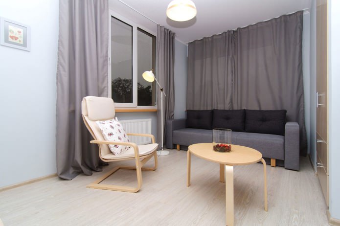
To expand visually a small room, the walls were painted in a light gray-blue shade. Cold light colors visually “push” the walls, and the white ceiling seems higher. Light wooden floors combined with furniture of the same color give a feeling of warmth and coziness, softening cold colors.
Decor
To make the small apartment seem more spacious, the designers abandoned the excessive decor. The window was accented with a dark gray tulle curtain. It blends well in tone with the walls and highlights the window. Window sills are made of wood of the same color as the furniture, which gives the interior completeness.
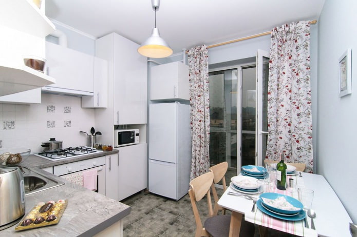
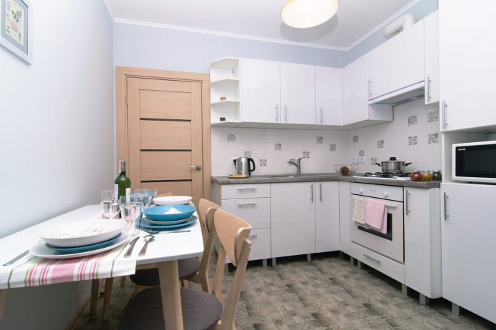
The light wooden floor is in harmony with the light furniture, the white lamps have the same finish as the furniture, and together they create a harmonious color space in which you feel calm and comfortable. Floral-patterned kitchen curtains and turquoise tableware create a bright, festive mood and serve as an active accent in the interior.
Storage
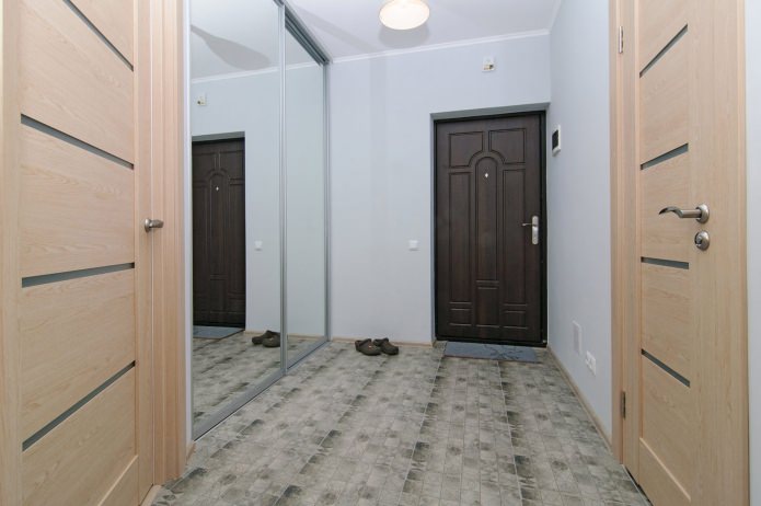
In order not to clutter up an already small apartment, the cabinets were built into the partition wall between the living room and the nursery. It turned out two large built-in wardrobes that completely solve all the storage problems for both adults and children. Everything will fit - and shoes, and seasonal clothing, and bedding. In addition, in the hallway there is a huge wardrobe.
- Children’s. The main plus of the design of a one-room apartment for a family with a child is the allocation of a special “children's” zone, which provides everything for the convenience of both the baby and the teenager. A cupboard under the worktop of the working area will contain textbooks and notebooks, and a large countertop will allow you not only to sit comfortably for lessons, but also to do your favorite thing, for example, modeling or sewing.
- Kitchen. A two-story kitchen set contains all the necessary supplies and small household appliances. The space above the refrigerator is also occupied by a capacious box for storing various trifles.
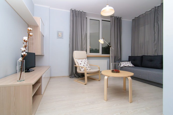
- Living room. In the living room area, in addition to a spacious built-in wardrobe, a small modular system of closed and open shelves appeared. There is a TV on it, there is a place for books and various accessories - candlesticks, photographs in frames, souvenirs that travelers love to bring home.
Shine
The minimalist interior is enlivened by loft-style lamps made in light shades. They are expressive and concise, and are in perfect harmony with the surroundings. The placement of the fixtures is thought out for maximum comfort.
In the nursery there is an elegantly shaped table lamp, in the kitchen there is a ceiling chandelier. To make it convenient to study, the central suspension is responsible for overhead lighting in the living room, while the reading lamp is provided by a floor lamp that can be moved either to the sofa or to the armchair.The entrance area is brightly lit by an open lamp so that in the sliding wardrobe closed by mirrored doors to visually enlarge the hallway, you can easily find the right thing.
Furniture
In the design of a one-room apartment, much attention is paid to furniture. It is made of light wood and metal, which gives it a modern look. The forms are laconic, flowing, which is why the objects do not look bulky and do not reduce the free space of the rooms.
The color scheme is calm, in harmony with the color of the walls - gray-blue. A rocking chair in the living area is a luxury item that adds coziness. It is very pleasant to relax and spend time reading books or watching television programs. The bed in the nursery on the “second floor” above the work area is a decision dictated by the lack of space. But after all, children love to climb upstairs for relaxation!
A bathroom
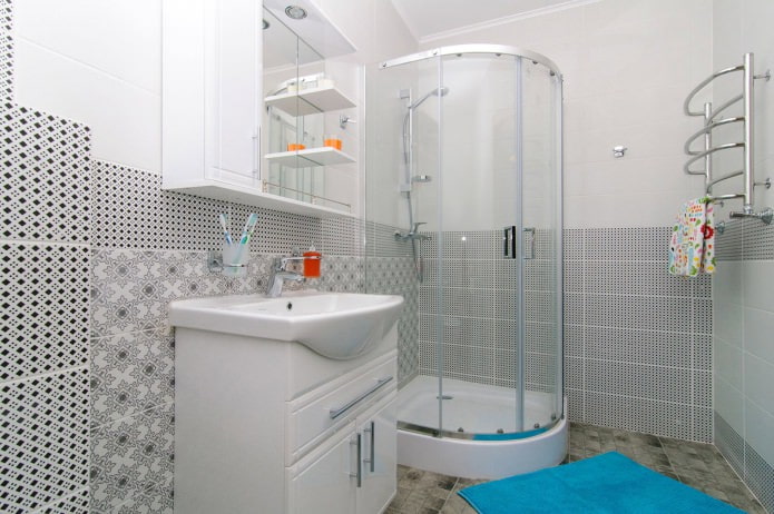
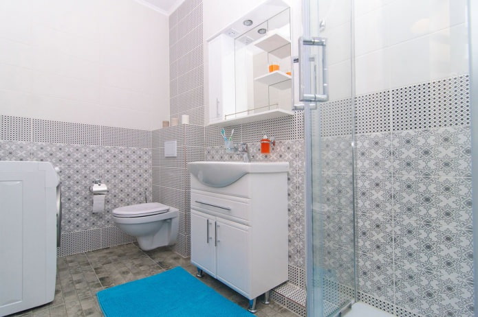
The combination of a toilet and a bath allowed to increase the area and put here everything that a modern person needs. Actually, the bath itself is not there, for the sake of saving space, it was replaced by a shower cabin, the transparent walls of which seem to “dissolve” in the air and not clutter up the room. Monochrome ornaments on the tiles not only refresh, but also additionally zone the bathroom.
Total
The project used only natural, pleasant to the touch materials of good quality. Elegant color combinations, functional furniture, thoughtful lighting scheme and minimal but active decor allowed creating a soft, comfortable interior, in which everything serves to rest and relaxation.


 Design project of two in Brezhnevka
 Modern design of a one-room apartment: 13 best projects
 How to equip the design of a small apartment: 14 best projects
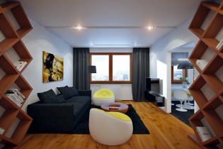 Design project of the interior of the apartment in a modern style
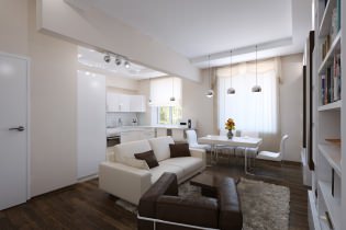 Design project of a 2-room apartment of 60 sq. M. m
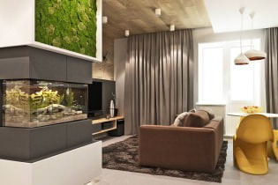 Design project of a 3-room apartment in a modern style