Layout
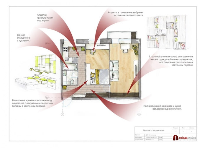
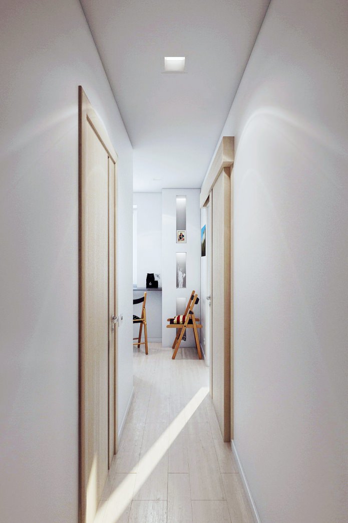
In the interior of a 2-room apartment, the entrance hall and the kitchen are connected by a corridor. A sliding door to the bedroom allows you to further expand the space and visually combine all the rooms in the apartment, except the living room. Such isolation of a living room is justified, since quite often it plays the role of a guest bedroom.
Thus, all functional areas are divided, but in general the interior of the apartment is 46 square meters. It looks holistic due to the use of neutral light colors as the main color in all rooms. Against this background, bright color accents of textiles, posters, decorative furniture facades are especially well perceived.
Living room
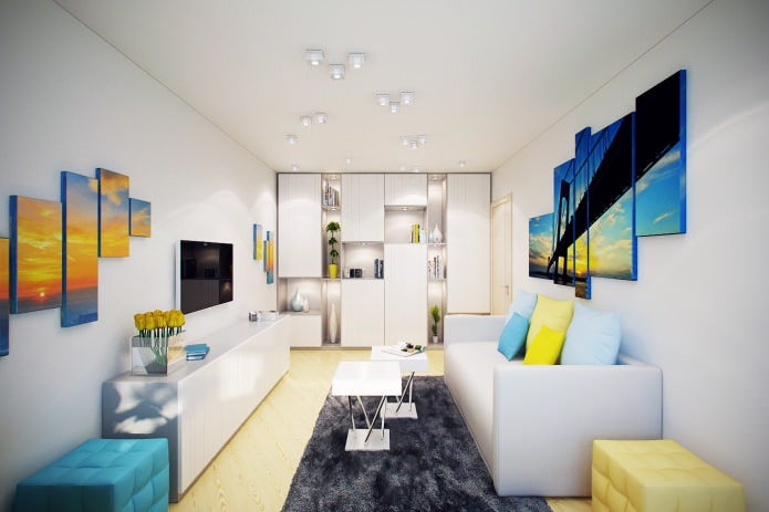
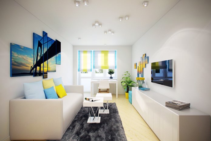
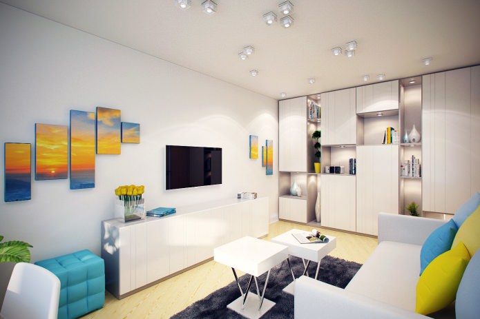
The interior of the 2-room apartment is designed in the same style, but each room has its own “face”. In the living room, first of all, the ceiling attracts attention, on which small square lamps are randomly scattered.
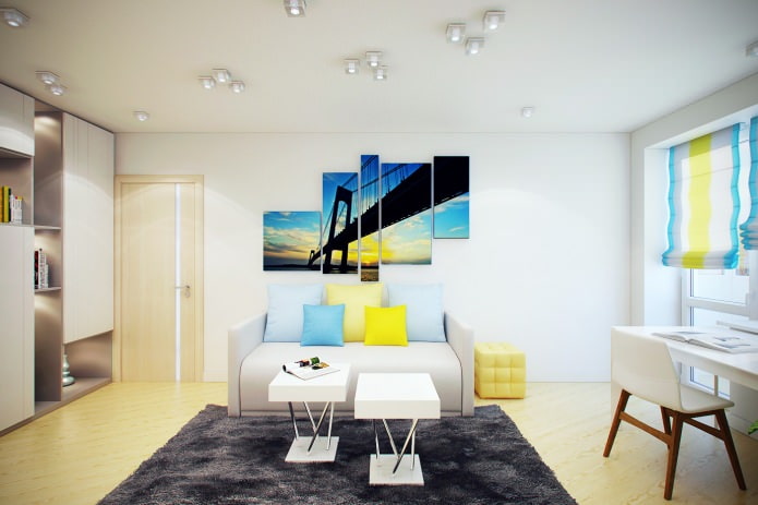
Yellow and blue are the primary colors used in the decor. They are present in furniture decoration, on curtains, in posters above the sofa and on the opposite wall.
Two small tables can be combined or used separately from each other, two pouffes - one yellow, and the other blue as freely move at the request of the owners. Using them, in the living room you can accept more guests. All this riot of colors of the interior of the apartment is 46 square meters. m. in the living room softens and combines a calm dark gray carpet.
Opposite the window is a roomy rack. It will store books, souvenirs, as well as bedding and other things that should not be put on public display. Therefore, part of the shelves is left open, and part is closed by facades of a neutral shade. Irregular alternation of open and closed shelves gives dynamism to the room.
Kitchen
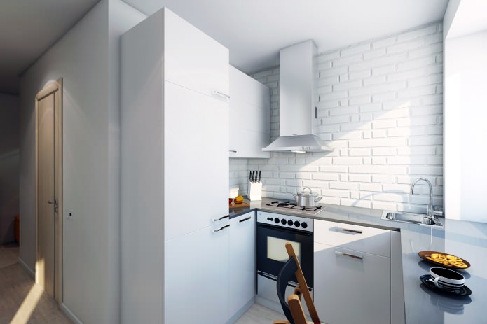
The interior of the apartment is 46 square meters. m. especially stands out the kitchen. Small, painted white in order to appear more spacious, it, nevertheless, has its own, quite definite character. It is determined by the design of the apron and the wall behind the stove and wears a pronounced “industrial” style.
Bleached brick walls, a metal hood with a high “pipe” of simple geometric shape - all this clearly refers to the style of the loft.
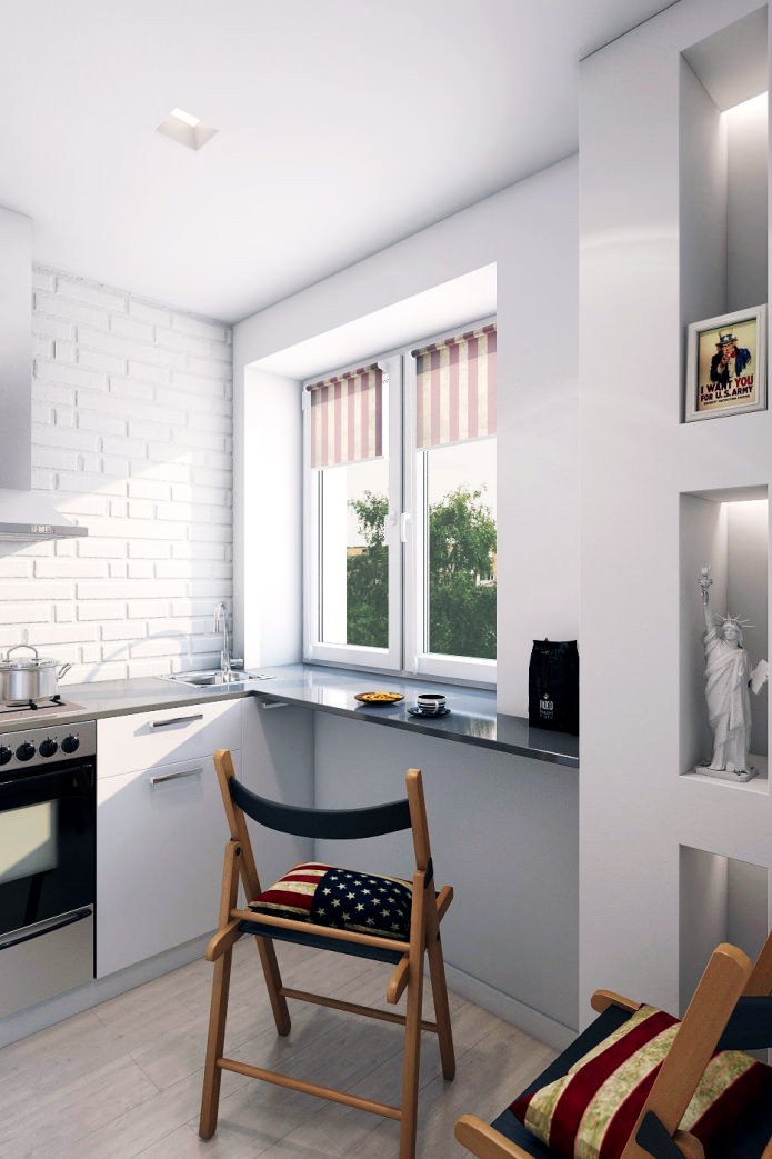
Wooden folding chairs take up little space and fit perfectly into the atmosphere of the loft, especially equipped with decorative cushions for sitting in covers made of time-worn American flag.
The small size of the kitchen does not allow you to organize a dining area in it, so the window sill was replaced with a wide tabletop made of artificial stone, for which you can conveniently have a bite or even dine.
Bedroom
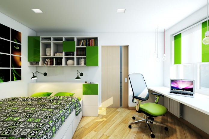
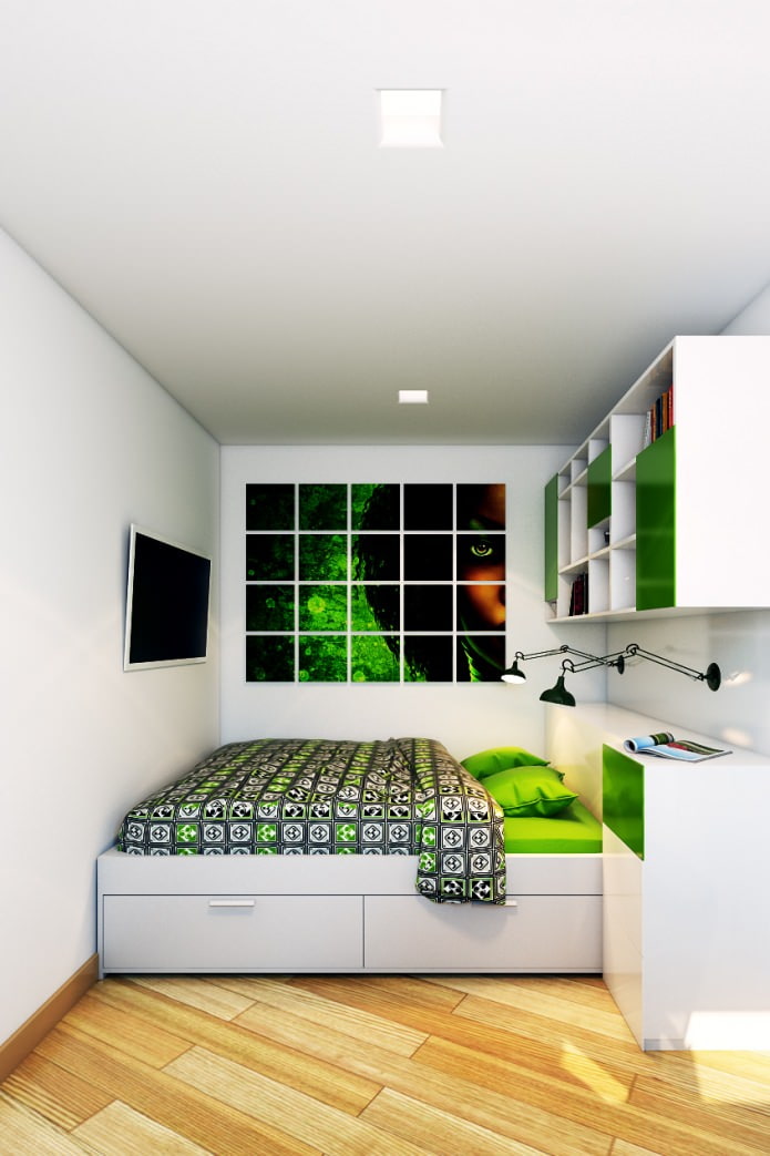
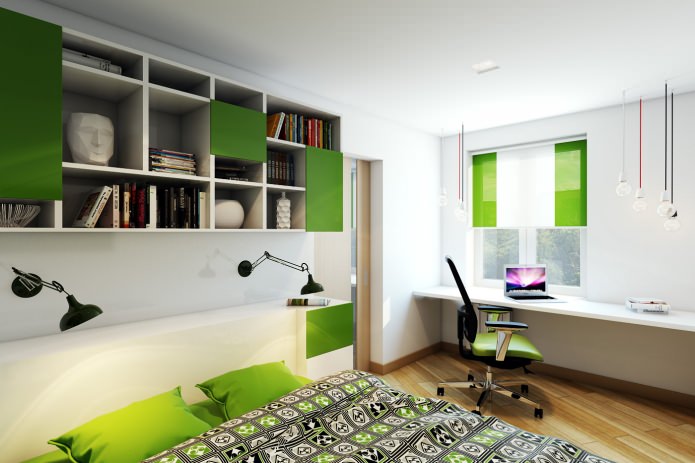
In the design of a two-room apartment in a panel house, bright, rich colors are used as accents, for example, in the bedroom it is a thick grassy green.
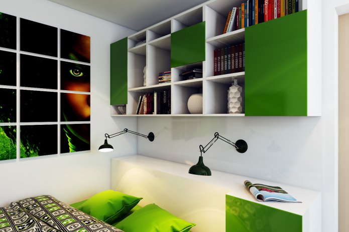
Not only green facades on the closed shelves of the rack, but also curtains on the windows, and even a chair. In the same colors, a poster is made on the wall above the bed, as well as a bedspread.
A working area is located along the window, above it are pendant lamps of different heights, which complicate the space and harmonize its perception.
The role of bedside lamps is performed by a black sconce, the arrangement of which can be changed due to the hinged base. In addition, they look very decorative.
Bathroom
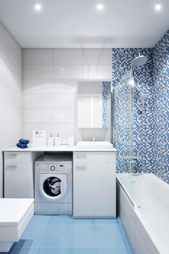
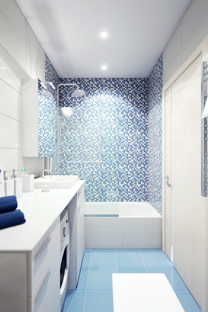
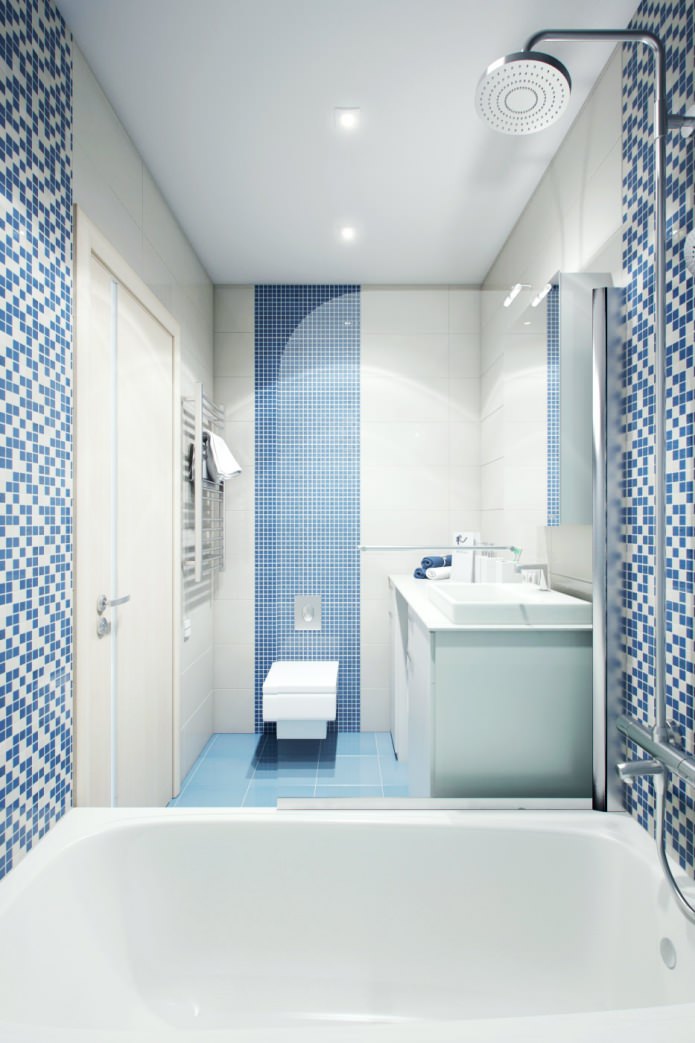
The design of a two-room apartment in a panel house provided for the combination of a toilet and a bathroom into a single whole. It turned out a room of sufficient volume to fit a washing machine into it - its place near the sink, and on top it is covered with a countertop, continuing to the wall.
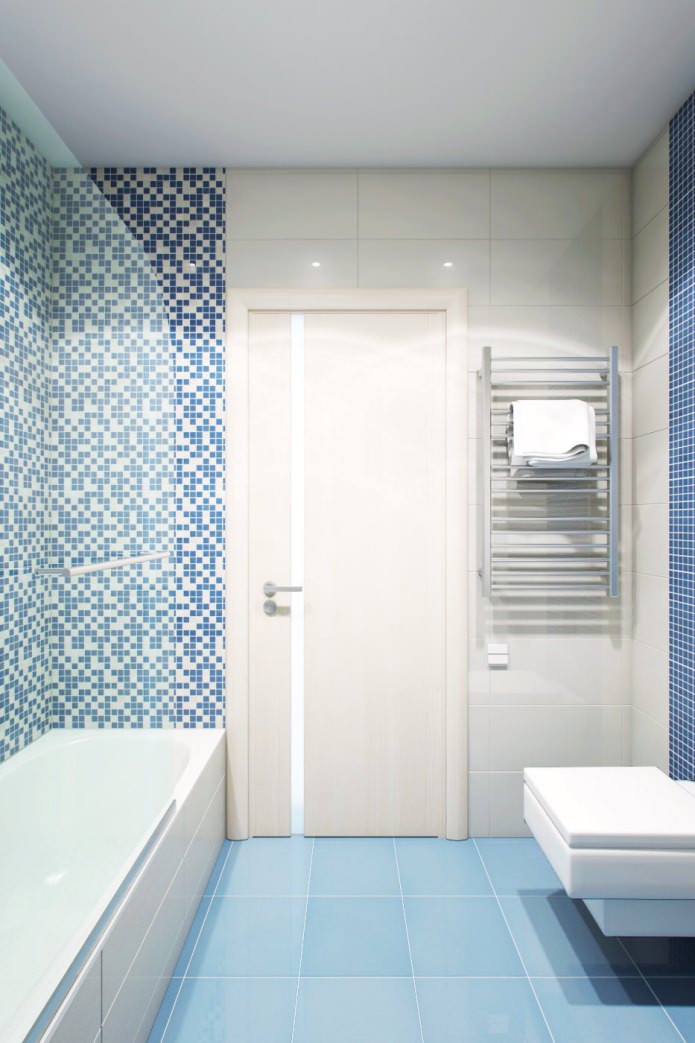
The pale blue floor is perfectly combined with white walls and with a “pebble” pattern of decorative tiles, which lined the walls surrounding the bath.
Behind the toilet, part of the wall is decorated with mosaic blue tiles. The theme of right angles in the design is supported by unusual shaped plumbing: both the bathtub, the sink, and even the toilet bowl are rectangular!
Entrance area
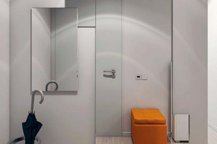
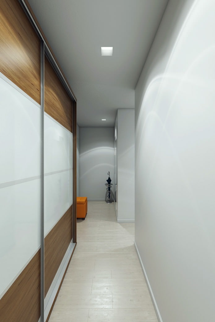
Acquaintance with the interior of a 2-room apartment begins with the entrance area. Immediately upon entering, guests are greeted by a bright orange pouf - the main and only decorative element of this zone.
The gray planes of the walls are broken by mirrors of different sizes - this gives the interior dynamism. Since the floors in the hallway are experiencing the greatest load, they were laid out with ceramic granite tiles, but the pattern was chosen “under the tree” to give the room more warmth. The tile pattern is in harmony with the cabinet finish. To save space, the door to the bedroom was made sliding.


 Design project of two in Brezhnevka
 Modern design of a one-room apartment: 13 best projects
 How to equip the design of a small apartment: 14 best projects
 Design project of the interior of the apartment in a modern style
 Design project of a 2-room apartment of 60 sq. M. m
 Design project of a 3-room apartment in a modern style