Entrance area
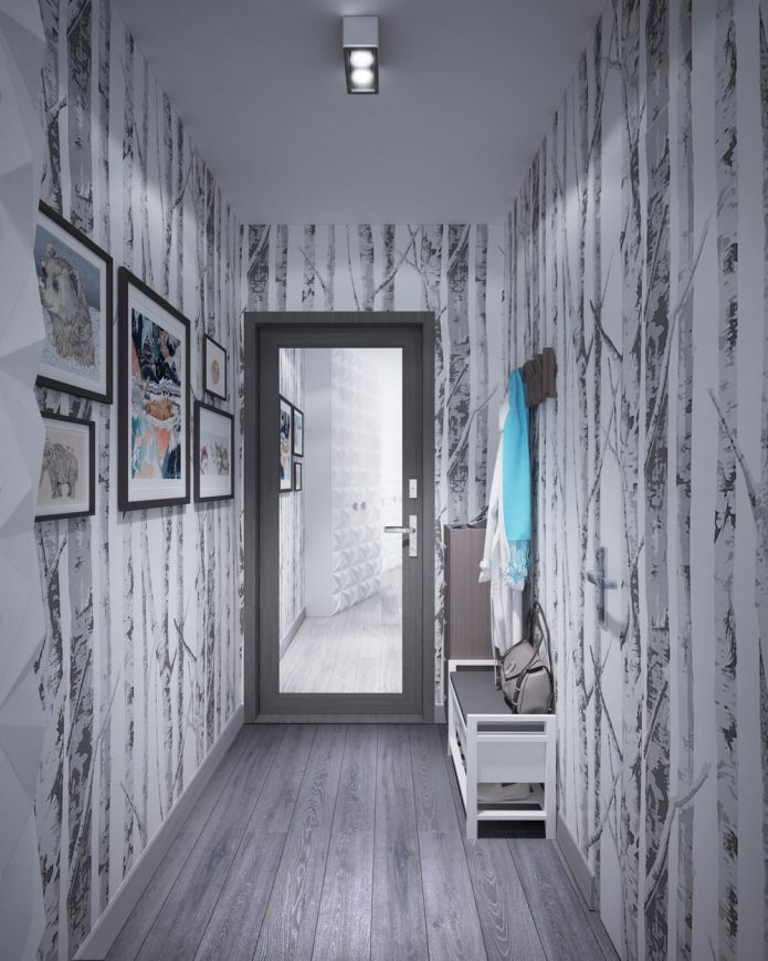
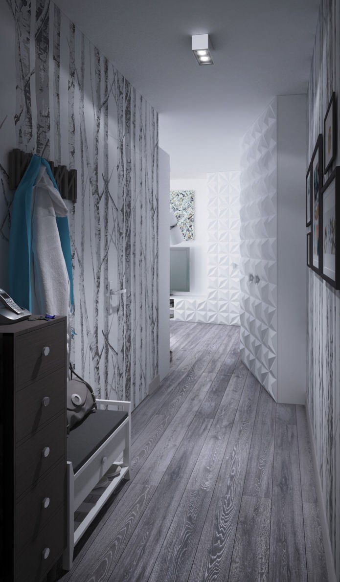
The hallway area is small - only three square meters. To visually expand it, designers used several popular tricks: verticals on the wallpaper “raise” the ceiling, using only two colors slightly “pushes” the walls, and the door leading to the bathroom is covered with the same wallpaper as the walls. The Invisible system, which assumes the absence of baseboards around the door, makes it completely invisible.
Also in the interior of the apartment is 34 square meters. m. mirrors are used as one of the most effective ways to increase space. The doorway panel from the entrance hall is mirrored, which not only increases its area, but also makes it possible to see yourself at full height before exiting. The narrow shoe rack and the low bench, above which the clothes hanger is located, do not interfere with the free passage.
Living room
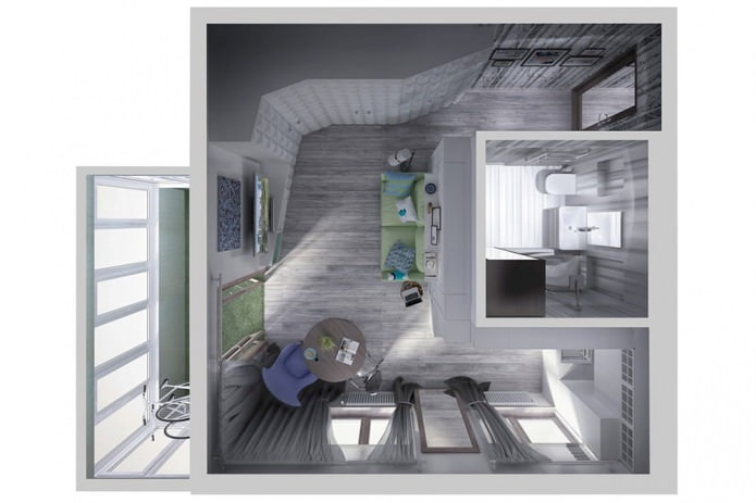
In the design project of a small apartment there is no space for a separate bedroom - the room area is only 19.7 square meters. m, and in this area it was necessary to fit several functional zones. But this does not mean that the owners will experience inconvenience during sleep.
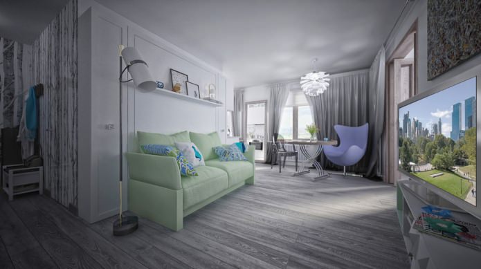
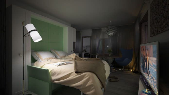
The sofa in the living area at night turns into a full bed: the cabinet doors open above it, and a comfortable double mattress falls directly onto the seat. The side parts of the cabinet have sliding doors, followed by shelves for storing books and documents.
During the day, the room will be a cozy living room or study, and at night it turns into a cozy bedroom. The warm light of the floor lamp near the sofa will create a romantic atmosphere.
The only table in the room is transformed, and, depending on the size, it can be either coffee, lunch, work, or even a table for receiving guests - then it reaches a length of 120 cm.
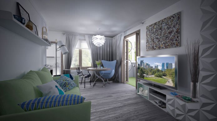
The color of the curtains is gray, with a transition from a dark shade near the floor to a lighter one near the ceiling. This effect is called ombre, and contributes to the visual perception of the room as higher than it actually is.
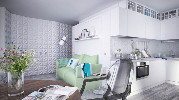
The design of the studio is 34 square meters. m. the main color is gray. Against its calm background, additional colors are well perceived - white (cabinets), blue (armchair) and light green in the upholstery of the sofa. The sofa not only serves as a comfortable place to sit and support the bed at night, but also has a roomy drawer for storing linen.
The interior of the apartment is 34 square meters. m. used the motives of the Japanese folk craft - origami. 3-D panels on the doors of a huge wall cabinet, shelf decor, candlesticks, lampshade chandeliers - they all resemble products made of paper.
The depth of the cabinet with voluminous facades varies in different places from 20 to 65 cm. It begins almost in the entrance area, and ends with the transition at the bottom to a long curbstone in the living room, above which a television panel is fixed. In this pedestal, the outermost section is upholstered from the inside with soft, delicate material in harmony with the color of the sofa - the beloved cat of the owners will live here.
The tiny table near the sofa is also multifunctional: during the day it can be a workplace, it even has a USB port for connecting equipment, and at night it successfully plays the role of a bedside table.
Kitchen
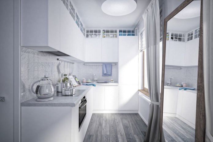
In the design project of a small apartment in the kitchen allocated only 3.8 square meters. m. But this is quite enough if you correctly think through the situation.
You can’t do without hanging cabinets in this situation, and they are lined up in two rows and occupy the entire wall - up to the ceiling. So that they do not “crush” massiveness, the upper row has glass facades, mirrored rear walls and lights. All this visually facilitates the design.
Origami elements also entered the kitchen: the apron seems to be made from crumpled paper, although in reality it is porcelain tile. A large floor mirror extends the kitchen space and seems like an additional window, and its wooden frame supports eco-style.
Loggia
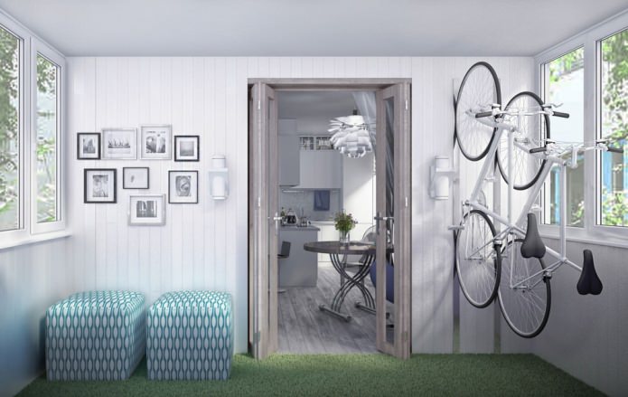
When developing the design of a studio apartment 34 square meters. m. tried to use every centimeter of space, and, of course, did not ignore the loggia of 3.2 square meters. m. It was insulated, and now it can serve as an additional resting place.
On a warm floor laid a fleecy carpet, the color of a young grass. You can lie on it, look through a book or magazine. In each ottoman there are four places for sitting - you can seat all the guests. Doors leading to the loggia fold and do not take up space. For storing bicycles on one of the walls of the loggia made special mounts, now they will not bother anyone.
A bathroom
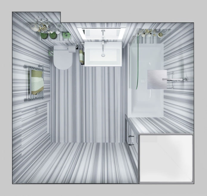
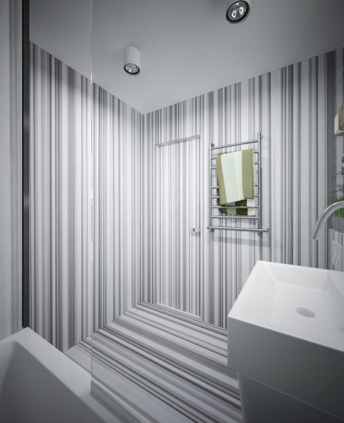
When developing a design project for a small apartment for a bathroom, it was possible to allocate a very small area - only 4.2 square meters. m. But these meters were ordered very competently, calculating ergonomics and choosing plumbing that did not take up much space. Visually, this room looks spacious thanks to the competent use of strips in the design.
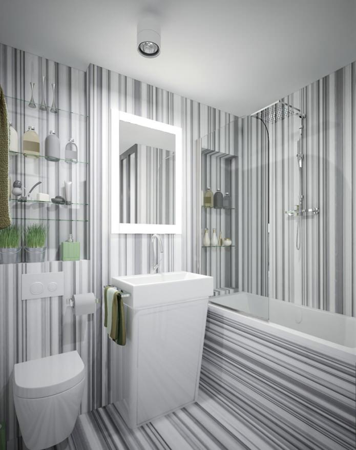
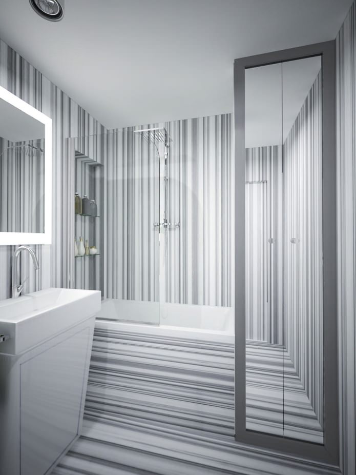
The design of the studio is 34 square meters. m. around the bathtub and on the floor - gray marble with dark stripes, and on the walls the marble pattern is duplicated with waterproof paint. As a result of the fact that dark lines are directed in different directions on different surfaces, the room “splits up” and it becomes impossible to evaluate its true dimensions - it looks much more spacious than it actually is.
A cupboard is located next to the bathroom, with a washing machine and an ironing board hidden in it. The mirrored facade of the cabinet also works on the idea of expanding the space, and this is especially effective in combination with the striped pattern of the walls and ceiling. The mirror above the sink has a backlight, and behind it there are shelves for cosmetics and various trifles.
When decorating the apartment 34 square meters. m. some pieces of furniture were made to order in order to fit exactly into the places reserved for them. The cabinet under the sink in the bathroom was also made according to design sketches in order to fit a separate storage system in it.
The bath was closed with a glass curtain to prevent water from splashing onto the floor, and shelves for shampoos and gels were made on one of the walls above it. To make the bathroom look as a whole, the door was also covered with a “marble” striped pattern.


 Design project of two in Brezhnevka
 Modern design of a one-room apartment: 13 best projects
 How to equip the design of a small apartment: 14 best projects
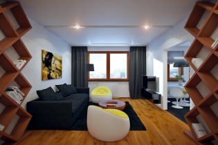 Design project of the interior of the apartment in a modern style
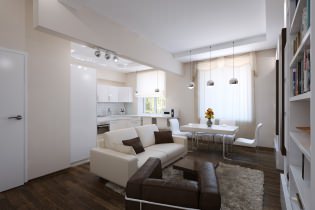 Design project of a 2-room apartment of 60 sq. M. m
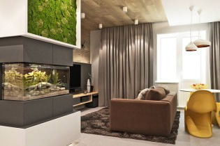 Design project of a 3-room apartment in a modern style