Light work surface
A light countertop is suitable for the interior of a kitchen of any style, it combines equally well with a light or dark kitchen. She is soiled and requires careful attitude from the hostess.
White color
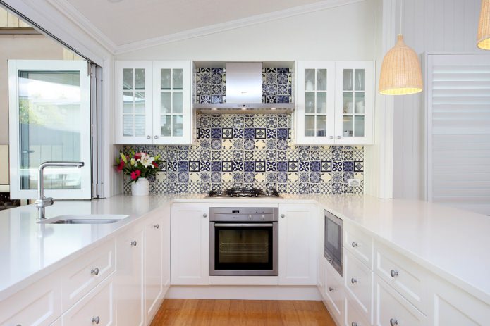
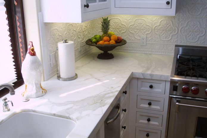
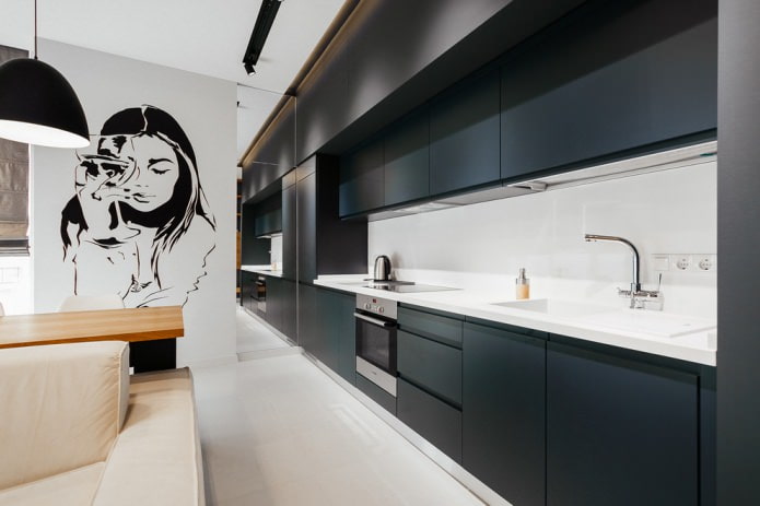
The most popular and controversial is the white color for the work surface. Glossy ideal surfaces are suitable for modern style, hi-tech, minimalism, Scandinavian. It is combined with a white or contrasting kitchen. Classic matte white stone worktop suitable for a conservative style.
Beige color
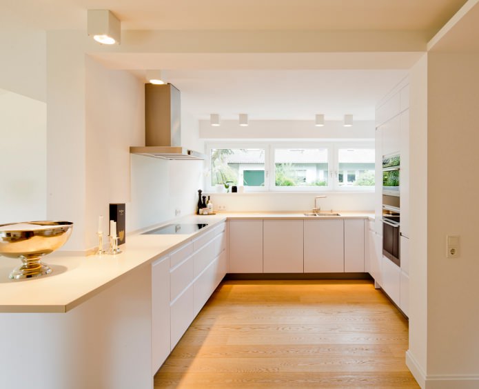
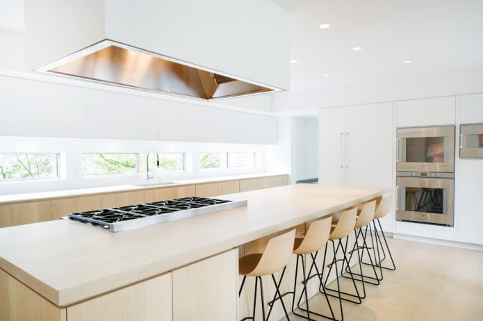
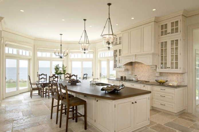
Beige in light shades of ivory, champagne, milk, vanilla, suitable for neutral countertops, which act as a backdrop for an apron or headset.
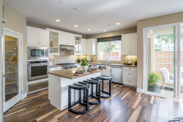
On the picture white kitchen interior with vanilla-colored worktop that does not attract attention, but at the same time separates the upper and lower spaces.
Sand color
The sand color of the countertops should be selected for a kitchen with wooden facades and with warm lighting, as well as for a dark set.
Light gray color
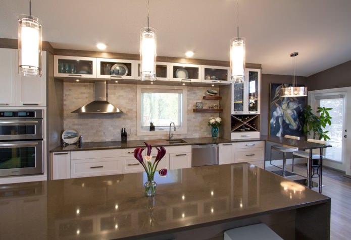
A light gray countertop is suitable for a white, gray and dark gray headset, as well as the color of concrete, which does not distinguish residual splashes and possible crumbs like white.
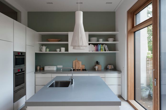
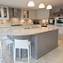
On the picture light gray countertop on the island table and the main working area, the color matches the walls and looks organically with a white suite.
Metallic color
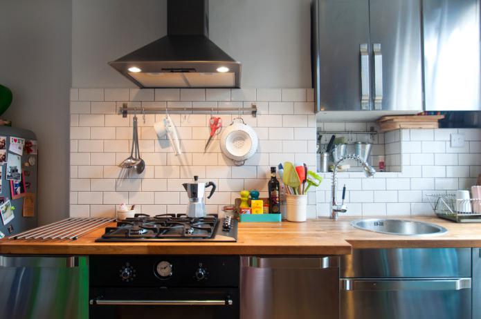
The color is metallic or the tabletop is made of aluminum / stainless steel in a steel shade, it is better to use it when creating a high-tech style. This is a practical choice for a often cooked kitchen.
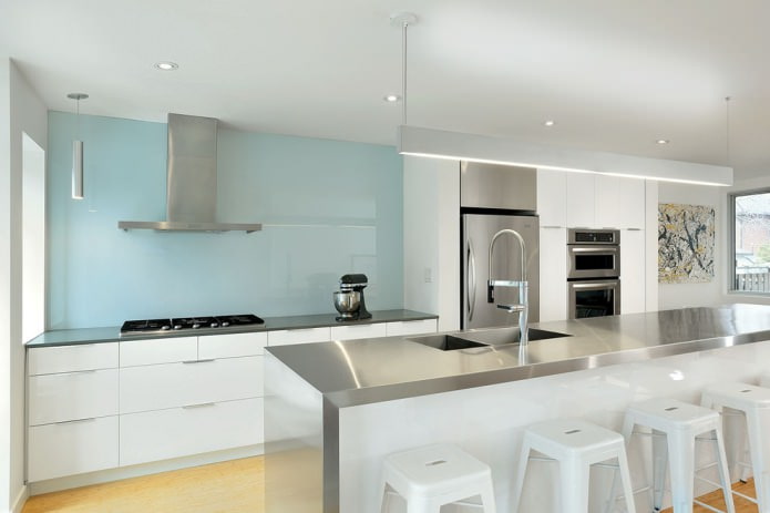
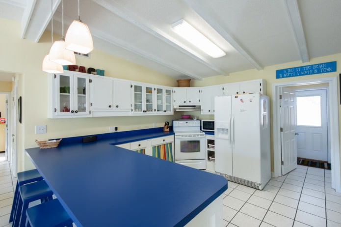
On the picture metallic top, which fits into the blue and white interior of a modern kitchen and resonates with kitchen appliances.
Dark worktop
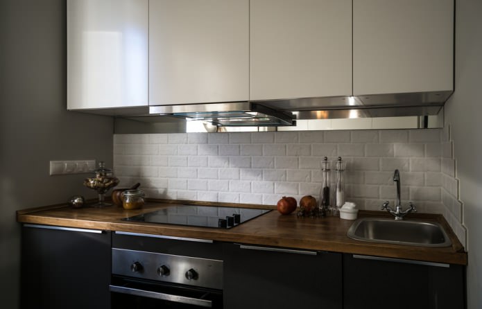
The dark shades of the working surface attract practicality, in a glossy and matte finish they look equally advantageous along with a light or dark kitchen set.
Black color
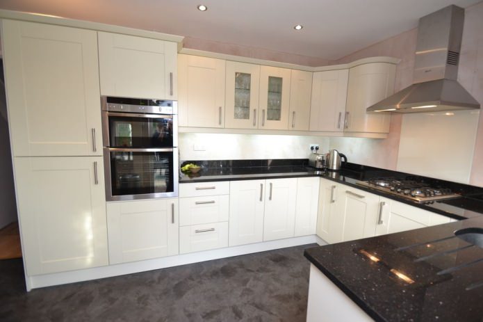
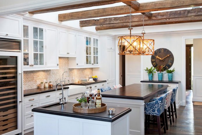
Black countertop and anthracite-colored look stylish. Suitable for a medium-sized and larger kitchen, visually separates the upper cases and lower cabinets of the headset. Looks good in any style.
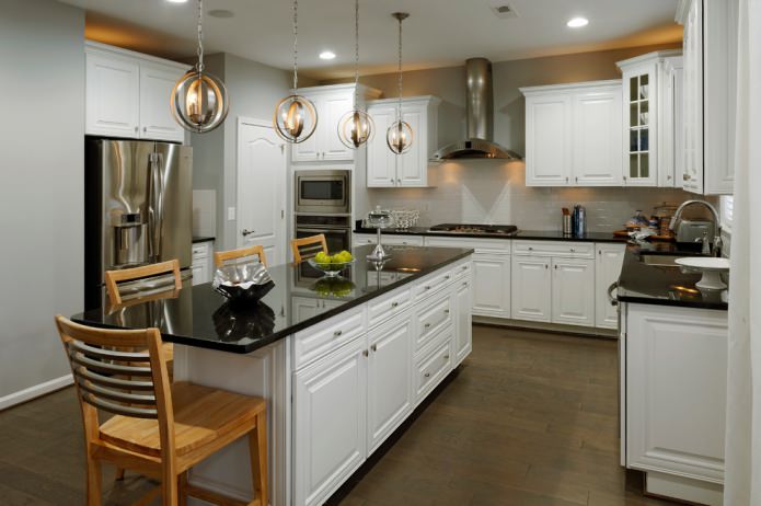
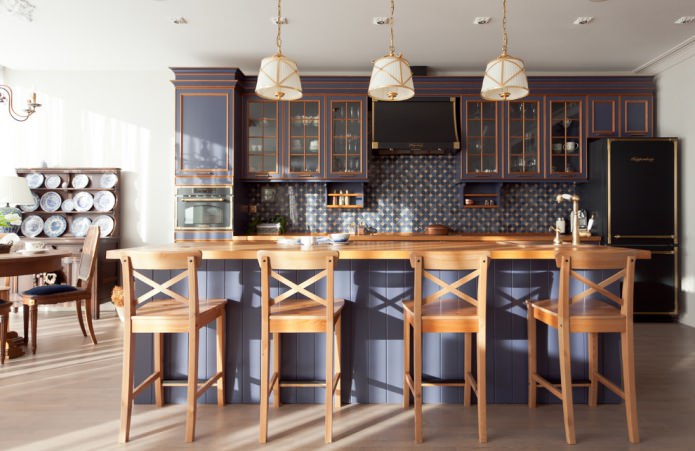
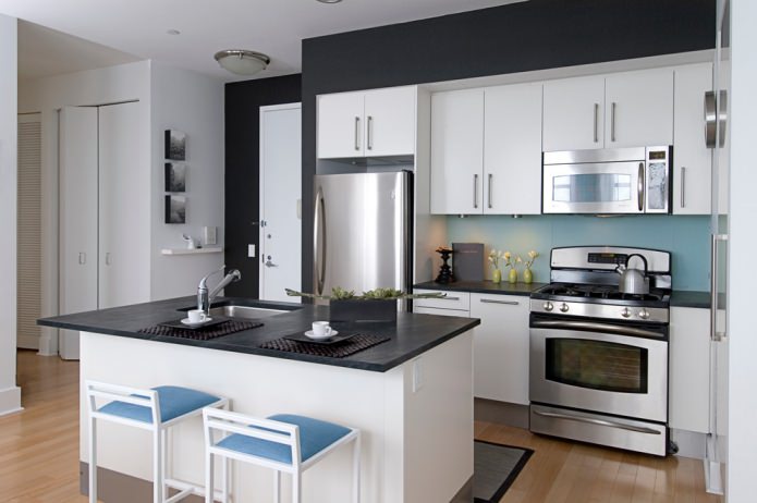
On the picture black glossy tabletop in the style of the interior of a modern classic is a stylish accent and practical solution.
Color galaxy
Color galaxy is suitable for the kitchen, which they want to diversify without the use of decor. The picture is a smooth transition of colors with characteristic interspersed.
Dark brown color
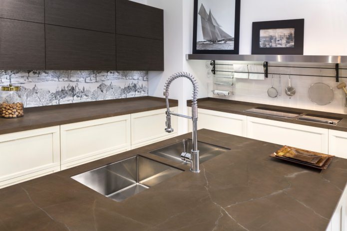
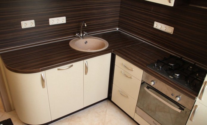
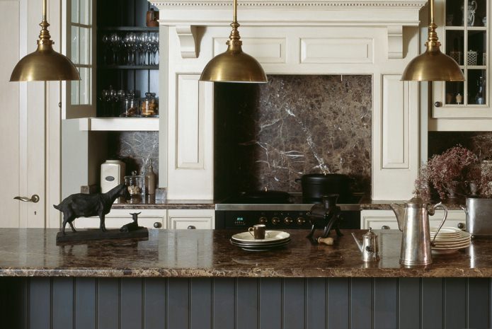
Dark brown shades, cappuccino color, chocolate, look good with the same floor or dining table. Suitable for bright, white kitchens as a contrast.
Dark grey
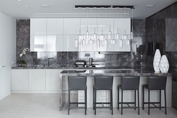
The dark gray work surface looks neutral, fits any style, combined with white, pastel, gray shades of the kitchen.
Choice of color countertops
To create a bright accent in the kitchen, it is enough to choose a colored work surface, which will be complemented by wallpaper or textiles.
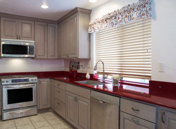
Red
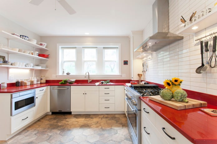
Red countertops are often found in combination with a white and dark headset. Red gloss can be repeated in the color of the dining table or floor finish.
Burgundy
Burgundy is better not to combine with red, suitable for the modern design of a bright kitchen.
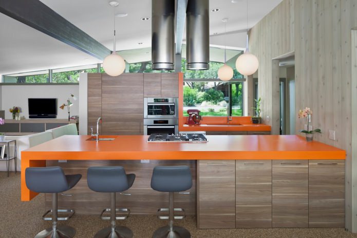
Orange
The orange countertop is suitable in combination with a white suite for a small kitchen, and in combination with dark brown furniture for a spacious room.
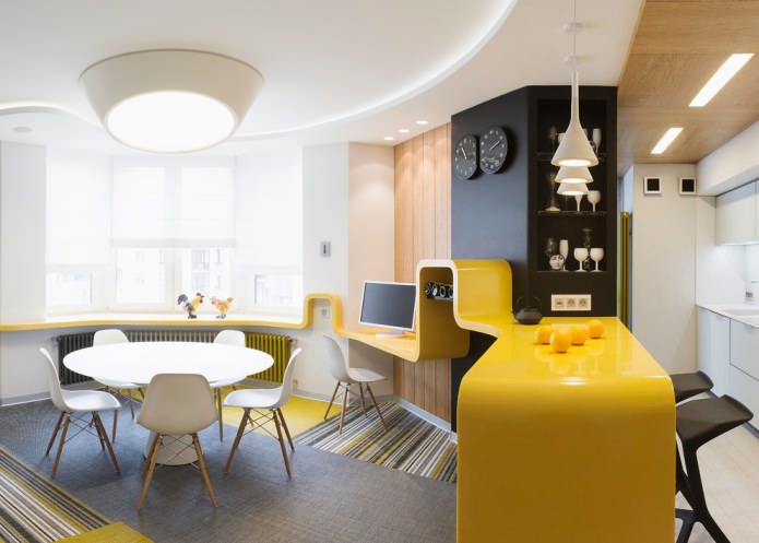
Yellow
Yellow adds light to the room, but it is better to choose it only for the countertop and another decor item, for example, tacks or a teapot, because yellow can cause eye fatigue.
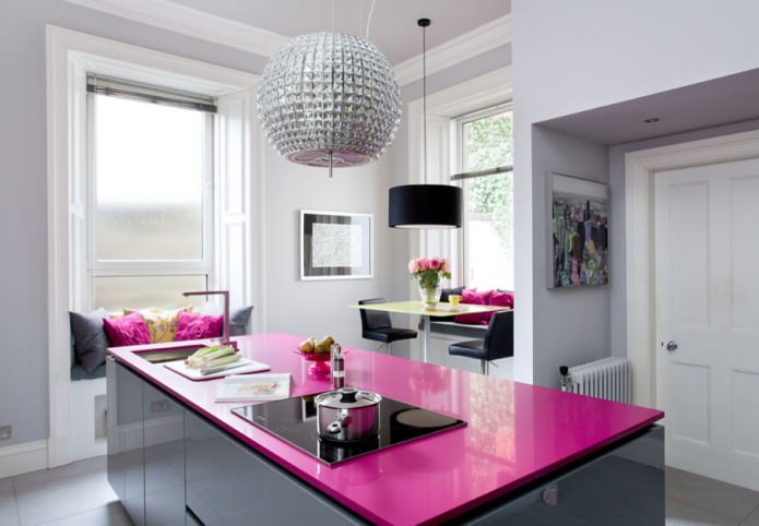
Pink
Suitable for lilac, pink, white, gray headset. A kitchen with a pink countertop looks impressive and at the same time non-aggressive.
Blue
Blue is best combined with gray and white cuisine in a Mediterranean and modern style.
Green
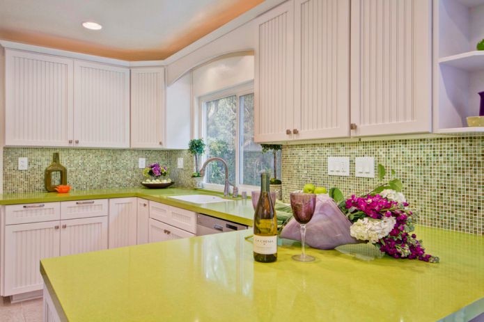
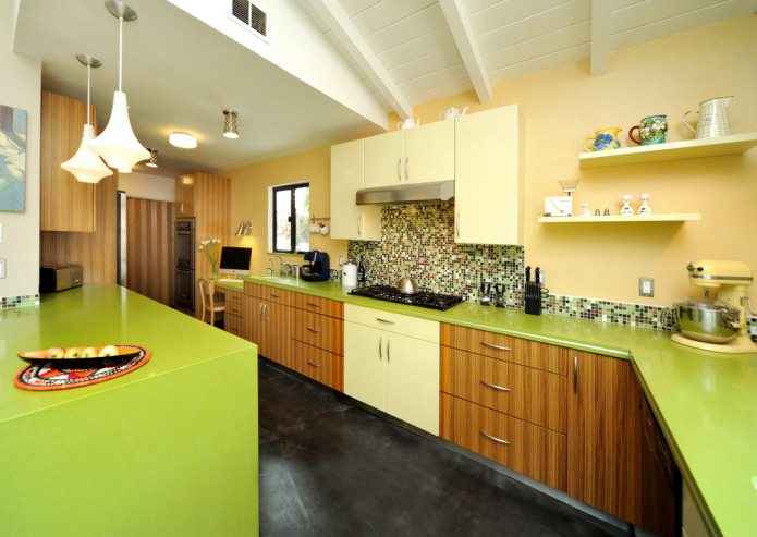
Favorably affects vision, suitable for rooms of any size. The lime shade of the countertop is suitable for a large space and the kitchen set is white, light gray, dark brown. The color of olive looks good in the kitchen in the style of Provence, creates a noble atmosphere.
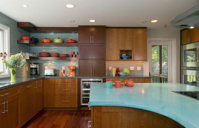
On the picture the bright green work surface is an accent, harmoniously combined with a white facade and a mosaic apron.
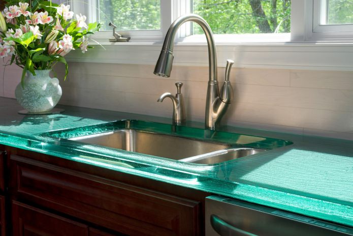
Turquoise
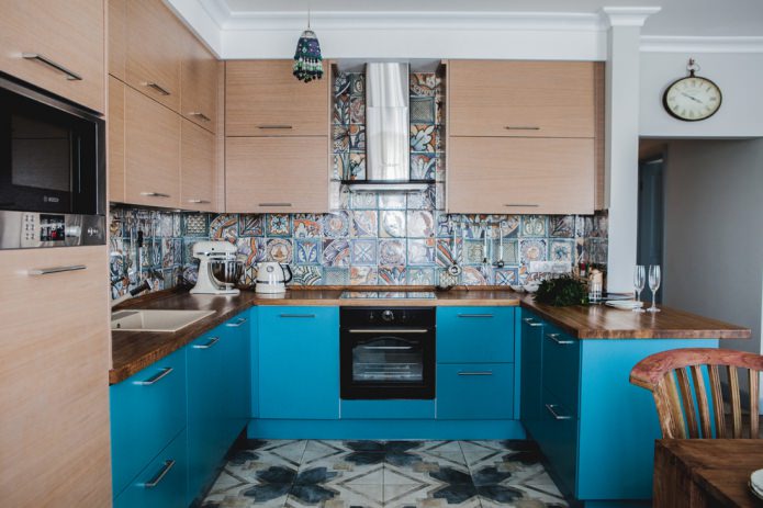
The turquoise countertop is equally well combined with a dark brown, white and black suite, as well as with colored yellow and pink facades.
Purple
The violet work surface can be combined with the same walls, but the facades are better to choose a light beige shade. Lilac countertops are suitable for Provence style kitchens or modern small kitchens.
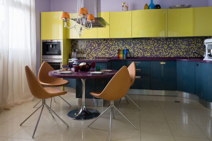
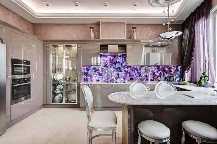
On the picture a combination of a purple table, countertop and mosaic tiles in a colored kitchen, the set of which consists of three colors.
Color and pattern of stone work surface
The stone work surface is not only expensive and wear resistant, but also has a unique pattern that does not repeat twice.
Granite
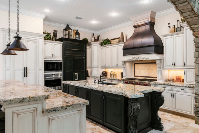
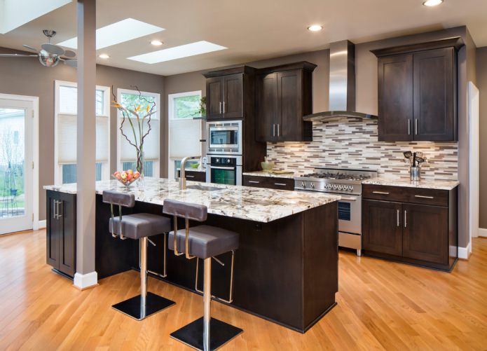
The color of granite depends on the mineral components, it can be pinkish, scarlet, gray, black, coffee shade.
Marble
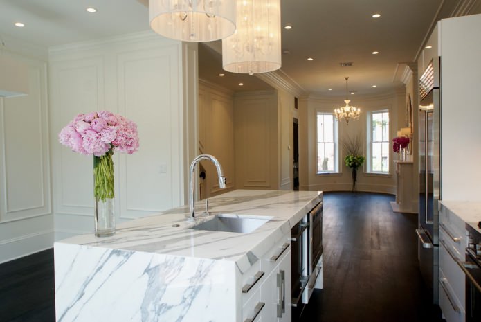
The color palette of marble includes the main white color with grayish, red, chestnut, green impurities.
Onyx
Onyx is presented in a yellow, beige and coffee shade with characteristic large white or black flat stains.
Almandine
The almandine countertop in the kitchen is particularly durable and resistant to high temperatures.
Opal
The working surface of opal can be cloudy or bright with a wood or stone texture, it can be golden, scarlet, black, milk, pink, blue.
Quartz
Quartz, or pressed granite, can be of any color due to the addition of paints, it can be completely white, which is extremely rare in nature.
Malachite
It is presented from light turquoise to emerald and black. It is notable for the smooth transition of color and the shapes of concentric circles.
Travertine
The countertop in the kitchen of travertine is gray, white, brown, gold.
Wood worktop
Oak
Oak is presented in several colors.
- White oak It happens white, ashy color due to bleaching fibers. Can be pink or gray streaked.
- Bleached oak It is combined with orange, violet, turquoise, gray, black and gold.
On the picture the kitchen is in eco style, where a bleached oak countertop is combined with a light floor and white trim.
- Bog oak
Bog oak is pure black or smoky, with a shade of gray. Suitable for white-gray, beige-brown, emerald, scarlet cuisine.
- Golden or natural oak has a gold, coffee, orange color. Tones pass one into another, combined with dark chestnut, gold, yellow, burgundy.
- Dark oak It happens chestnut and the color of dark chocolate, combined with white, ultramarine, gold, burgundy.
- Color wenge varies from gold to chestnut, burgundy, dark purple with black texture lines. It is combined with bleached oak, maple, ash, with blue, orange, cream, white, emerald cuisine.
Beech
It has a warm golden hue, reckoned with light wood, which is combined with, lilac, brown, gray, salmon set in the kitchen.
Nut
Walnut worktops are brown in medium and saturated depth with a gray or red undertone. It features dark veins and lighter strokes. It is combined with dark green, beige, sand purple, burgundy, milk, black.
The color of cherries in the kitchen can be considered golden, red or chocolate, combined with heavenly, milky, pale green, beige, coffee, pink.
Alder
It has a golden hue, honey orange without dark details. It looks like a golden oak, combined with gray, beige, pale red, burgundy, olive, lilac, white, black.
Ash
Ash is light (the color of coffee with distinct lines) and dark (the color of dark chocolate with the same texture). Light ash is combined with concrete, dairy, white, mint, brown flowers in the kitchen, and dark ash with burgundy, white, milk, green.
On the picture the working surface and the surface of the island part are made of light ash, which is combined with a dark gray set and emphasized by light inserts.
Terrado is similar to the color of asphalt, metallic and concrete. The gray base of the color is complemented by blackouts according to the type of wear. It is combined with a white, gray, dark brown, black set.
The working surface of bamboo is distinguished by a pattern that is created due to the pressing of the stems. It happens dark, light brown, brown with green veins.
The choice of color for countertops from different materials
Plastic
A tabletop with plastic can be no less practical, in addition, the PVC coating has a wide variety of textures, decor, imitation wood and stone.
On the picture a kitchen with a plastic worktop, which matches the apron in color and material, due to which there is no border between the work surface and the apron.
Laminated chipboard or MDF
Countertops in the kitchen are made of laminated particleboard or MDF using postforming technique, when under high pressure a plastic layer and a moisture-resistant coating are applied to the panel, and a drip tray is mounted at the ends to prevent moisture accumulation.
The laminated work surface in the kitchen can be dark or light, of any shade and design, repeating stone, chips, texture of oak or other wood. Also, a plastic tabletop can be made under marble or granite, be glossy or matte, do not fade in the sun.
Acrylic
The acrylic work surface in the kitchen imitates the color of the stone, it can be in any color with overflows and shades, in glossy or matte finish.
On the picture tabletop and working apron made of acrylic, which are made like stone and are combined with a white suite.
Color kitchen and countertops
You can choose the color based on the rules of combination in tone or contrast. You can also choose the color of the work surface in the color of the headset.
| Facade | Countertop |
| Gray facade serves as a backdrop for eye-catching elements and details, combined with neutral and bright colors. | White, light gray, dark gray, black, red, orange, dark green, pink, lilac. |
| White facade versatile and combined with many colors, the perfect choice for a kitchen of any size. | White, black, gray, red, burgundy, orange, brown in dark shades, bright shades of pink, green, yellow, purple, blue, turquoise, pastel colors. |
| Blue It is attractive in itself and needs to be balanced with neutral shades of textile, apron, walls and work surface. | White, light gray, beige, orange, yellow, black, light brown. |
| Beige It goes well with any warm and cold shades. | Beige is a tone lighter or darker, white, brown, the color of chocolate, vanilla. |
| Green kitchen sets are best combined with neutral or warm colors. | Yellow, red, brown, white, black, gray. |
| The black It attracts attention and needs to be diluted with dark light tones. | Pink, lilac, white, gray, metallic, black, brown, all shades of wood. |
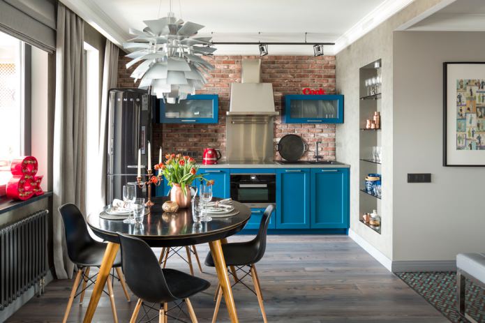
On the picture blue suite, which in the interior of the kitchen is complemented by light gray walls, a brick wall, a black dining group and a gray countertop. For such a combination, good lighting is important.
Color of table, floor, apron, sink and countertop
The color of the countertop can be harmoniously combined in contrast or find a response in the color of the dining table, floor or apron.
Dinner table
The countertop can be matched to the color of the dining group if it is in the kitchen. In order to diversify the color palette, you can choose a companion color, for example, a gray table, and a white countertop. Also, for the classic style, a combination of one color, for example, sand and yellow in different colors, is suitable.
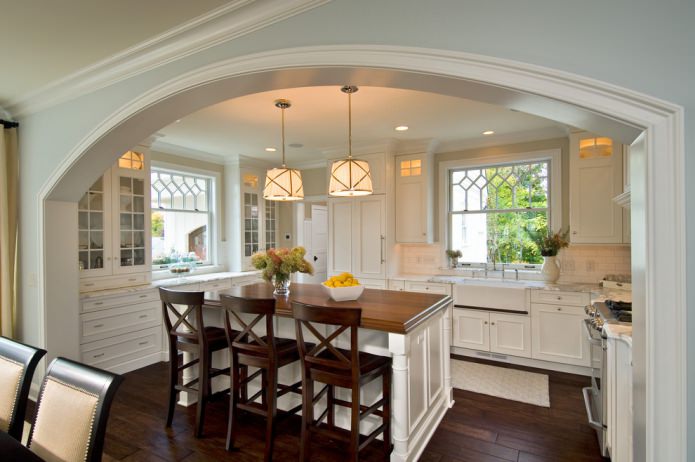
On the picture the countertop of the desktop and the island part of the kitchen is different in color, but it looks organically with a set and a shade of floor.
Floor
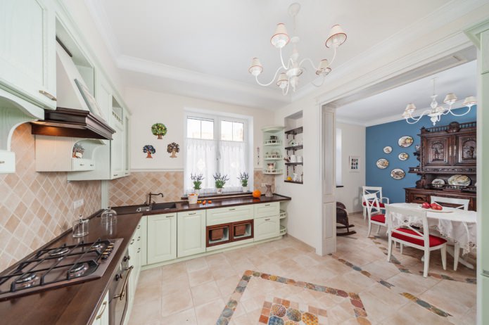
A flat work surface can be combined with the color of the floor in the kitchen. For example, a laminate or tile under a dark wood laminate will work well with the same worktop. A contrasting glossy black floor will blend in with a matte bright surface, and a dark beige tile will look good along with a honey-gold countertop.
On the picture the color of the floor matches the set, and the countertop matches the color of the kitchen walls.
Apron
You should not choose one tone for the apron and work surface, as this space will not give a clear visual line of demarcation. It is better to choose one color in different shades, for example, purple and violet, or light gray and concrete color. For contrast, an apron made of glass with photo printing, an apron made of mosaics. If the countertop in the kitchen is glossy, then it is better to choose an apron matte.
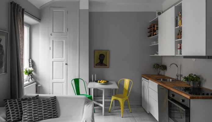
On the picture not only an apron, but also the walls are made in the same color with a work surface in a gray-white hi-tech style interior.
Sink
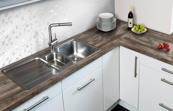
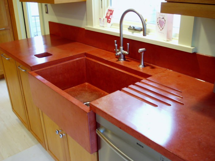
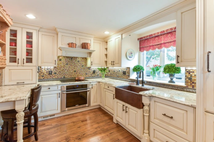
The sink in the kitchen can be ceramic, metal or stone, on the basis of this it can be the color of the countertop or stand out in contrast. The working surface, which merges with the sink, looks solid. The stainless steel sink with gray countertop emphasizes the overall style.
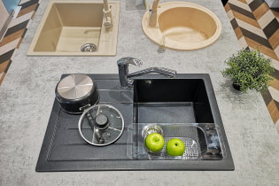
On the picture the sink and countertop are selected in one color, which makes the work surface uniform and without color differences.
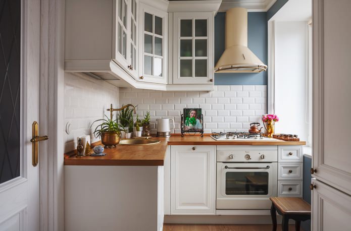
When choosing kitchen worktops, you need to start from the size of the room, the color of the headset and the finish. A bright work surface in itself serves as an accent, and a neutral one serves as a backdrop for kitchen utensils.


 How to choose the color of the sink for the kitchen?
 White kitchen: features of choice, combination, 70 photos in the interior
 Black suite in the interior of the kitchen: design, choice of wallpaper, 90 photos
 Modern design ideas for curtains for the kitchen - we make out the window stylish and practical
 Wallpaper design: 65 photos and ideas for a modern interior
 Design of a white kitchen with a black countertop: 80 best ideas, photos in the interior