Repair in removable Khrushchev
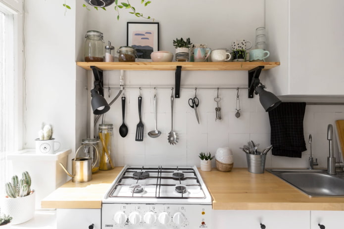
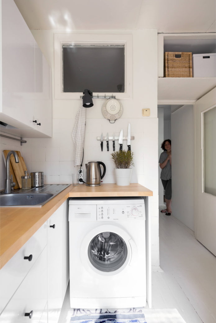
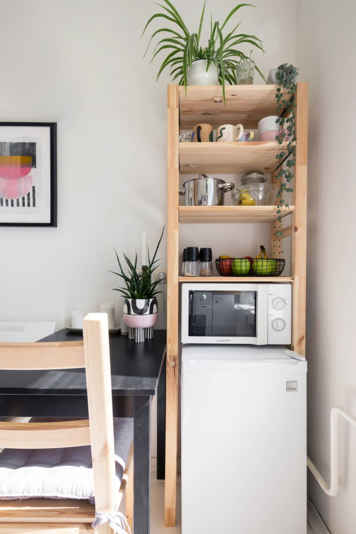
The girl, a novice designer, did this repair herself. The oil paint on the walls had to be covered with sand concrete, and then putty, since the old coating was difficult to remove. Tile on the apron is painted with resistant alkyd paint.
Instead of hanging cabinets, roof rails and an open shelf from a furniture board are used. A mini fridge and microwave fit in a wooden rack. The window between the kitchen and the bathroom was left untouched so that natural light penetrated into the bathroom. As a work surface illumination, ordinary lamps are used.
Pistachio Kitchen
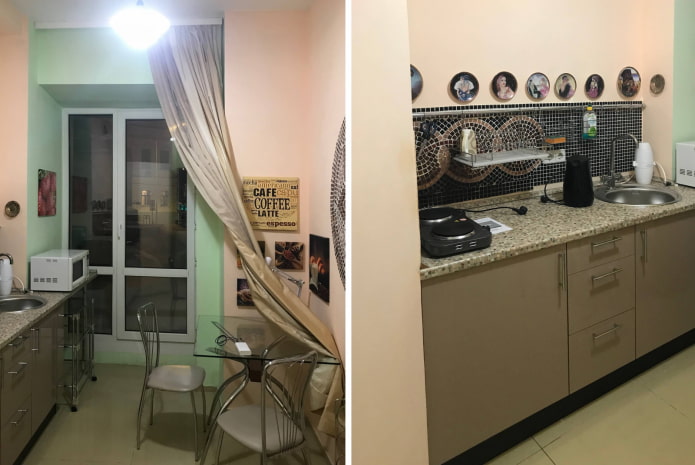
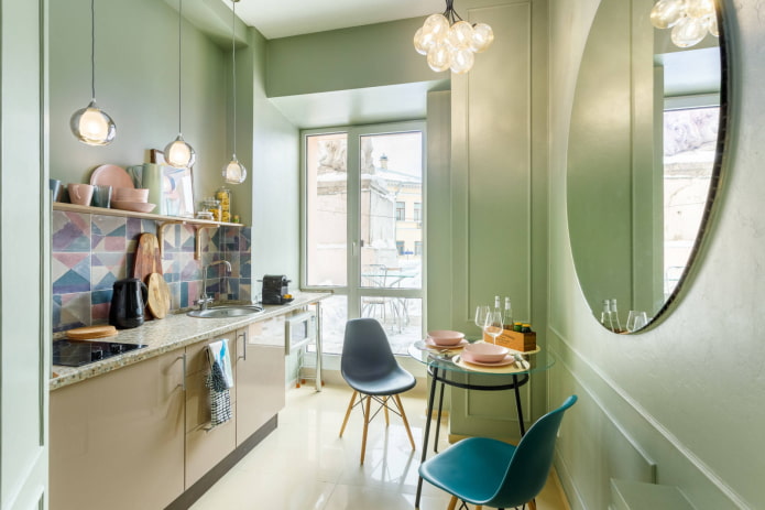
In this project, the old kitchen was entered into a new environment, but the apron was replaced: instead of mosaics, they used bright tiles in harmony with the new color of the walls. A round mirror masked the mosaic above the table, which began to look out of place. Added moldings.
The glass rectangular table was replaced with a round one to smooth the corners and free up space. The microwave was removed down to open the view from the window. We replaced the stove and hung the shelf over the apron, and hid the small refrigerator under the hob.
Scandinavian cuisine
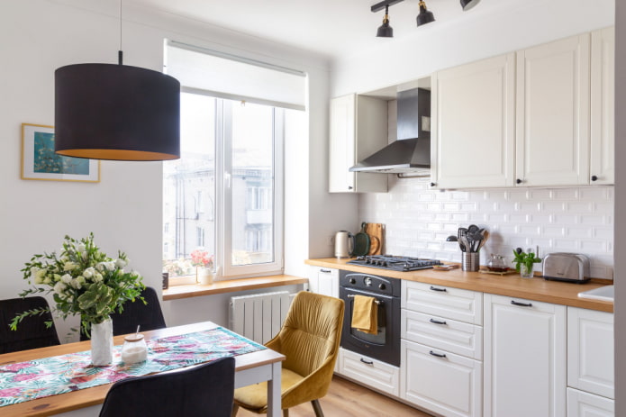
The apartment with high ceilings was bought by a young couple in an old foundation. The design was created independently, in accordance with the favorite style of the new owners.
During the repair, both furniture and decoration were replaced. The walls were painted white so that the cream facades seemed to dissolve in space, reflecting light and not overloading the kitchen. The hob, oven and chairs with velvet upholstery in graphite hue served as contrasts. Mustard yellow accents added brightness. All horizontal surfaces have a wood texture, including a window sill.
Kitchen for connoisseurs of painting
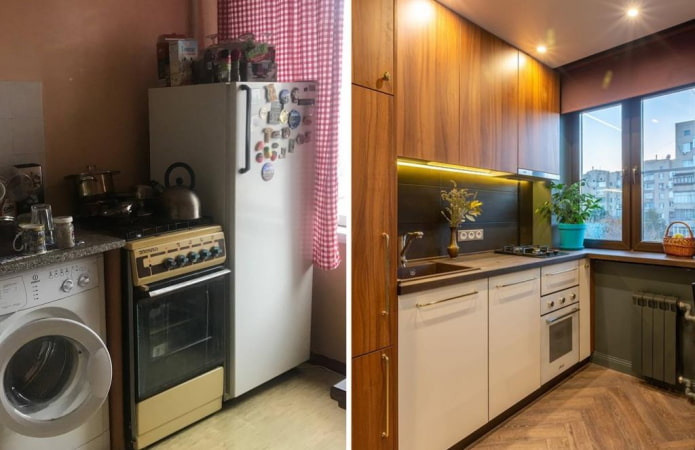
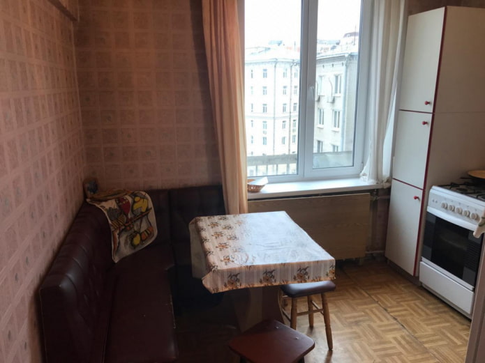
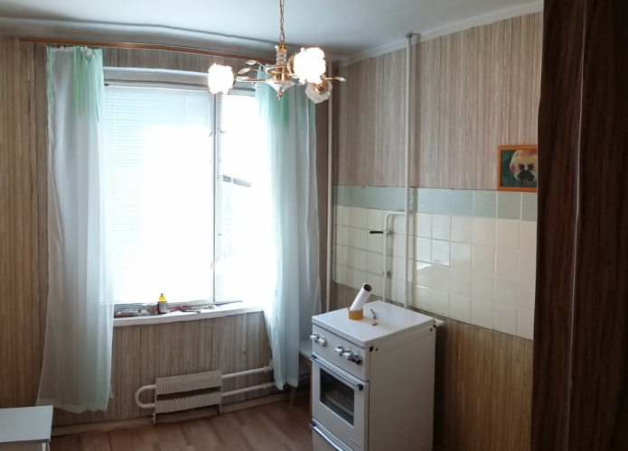
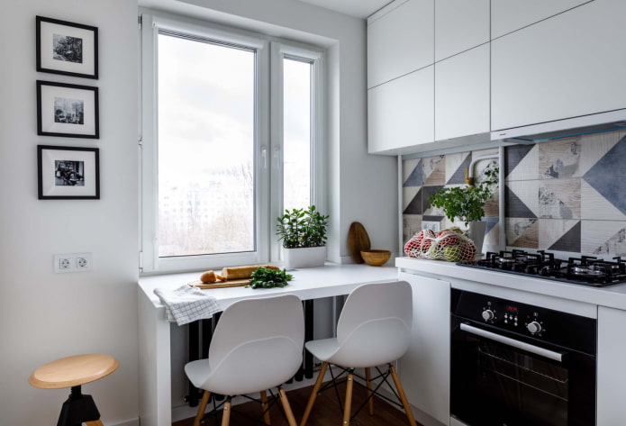
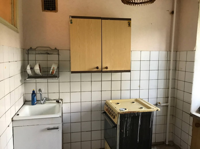
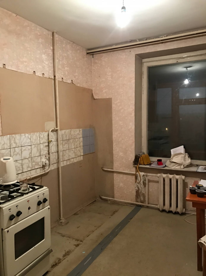
This kitchen is 7 square meters located in a studio apartment. Previously, it was an unremarkable "grandmother's option."
The new owner - a young girl - loves avant-garde painting, which served as the motive for choosing an apron. The rest of the space is less active: a white suite, an artificial stone countertop and walls become the backdrop for contrasting elements.
A feature of the interior is the dining table, which is a continuation of the windowsill. Only 3 people can sit behind it, but it is as practical as possible, as it saves space.
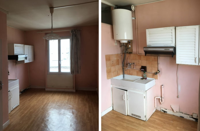
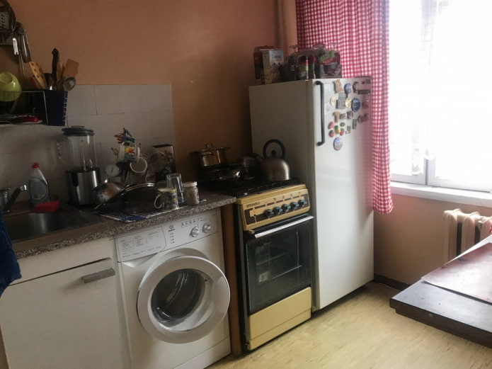
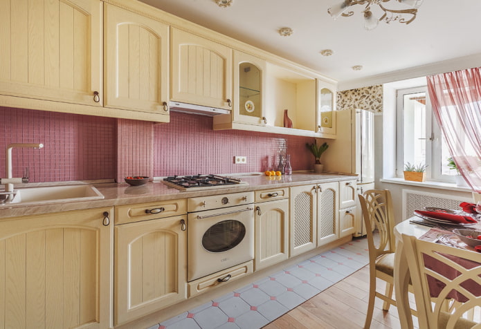
From the pink kitchen to the stylish dining room
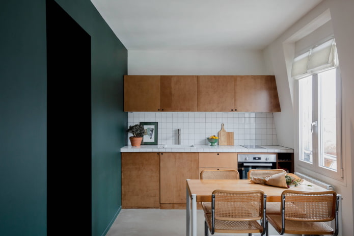
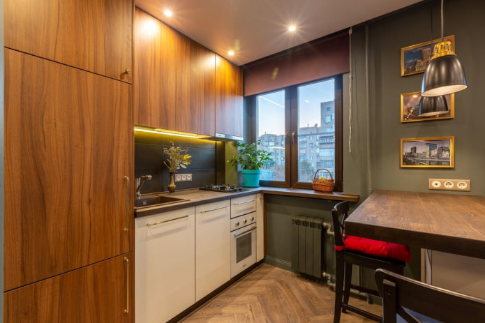
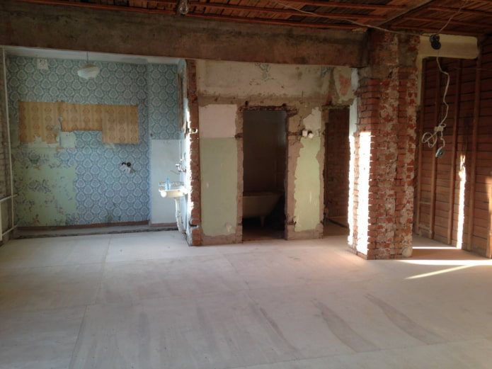
The owner of this kitchen does not cook often, but loves to receive guests. Thanks to joining the room, the kitchen has become much more spacious. It has a dining table with chairs, as well as a living room. Finishing, pipes and washing have been completely replaced. The old headset was old, instead of it IKEA modules were used with facades made to order. The apron and countertop were tiled with the same tiles.
The main feature of the kitchen is a wall painted in emerald color. It gives the room a visual depth and blends perfectly with furniture in wood shades.
Repair of kitchen in Khrushchev
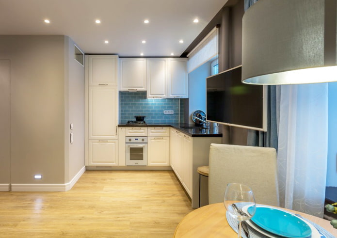
Another example of expanding space at the expense of the room. Since the kitchen is gasified, a sliding partition is provided between the rooms with the doors from the sliding wardrobe.
There is a storage boiler under the ceiling, and a low refrigerator below. The design is masked by the facade, so it looks solid. The sink was installed near the window, since the battery was already absent when buying an apartment. Instead, a heating pipe passed, which was painted in the color of the wall: this allowed not to build a massive box.
Lighting in the kitchen was organized using spotlights, since the ceiling in Khrushchev is only 2.5 m. The TV on the bracket can be rotated both towards the kitchen and the living room.
Kitchen with a breakfast bar
Incredibly cozy kitchen-living room turned out by the owner of this apartment. Discreet natural colors were used, the refrigerator is built into the set with a wood texture. There is not much space for cooking, but the window sill serves as an additional space. The hob consists of two burners, which also saves valuable space.
Instead of a dining table - a bar counter that zones the room. The countertop is solid treated with protective oil, it is beautiful and pleasant to the touch. The battery is painted from a spray can in the color of the wall: thanks to this, I did not have to put a protective screen that “eats” the space.
Loft plus minimalism
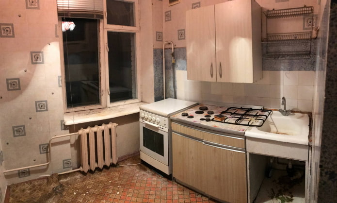
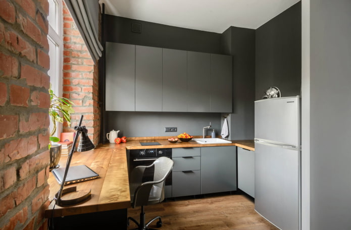
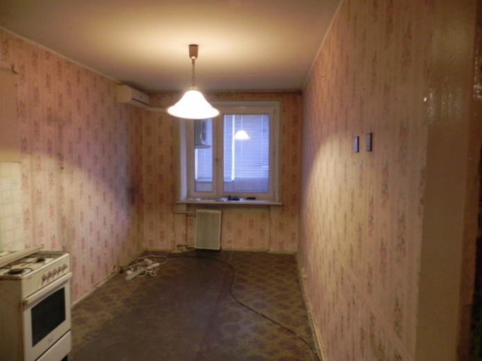
The "before" photo shows that the kitchen occupies part of the living room and cannot boast of dimensions. The facades in the new kitchen do not have handles, and the color is slightly lighter than the gray walls, so the kitchen looks stylish and concise. The walls are covered with high-quality paint, including an apron that can be washed.
Brickwork is real, it gives the interior texture. Also, the industrial style can be traced through the use of wood: window sills and countertops are made of heat-treated birch and varnished. A concrete beam was left under the ceiling: it was cleaned and also varnished.
Kitchen-dining room in a studio apartment
This interior belongs to middle-aged spouses who dreamed of a bright dining room. The elongated room was zoned with different floor coverings: tiles and massive boards. The kitchen furniture was built with the letter "G" and entered all the necessary equipment.
Thanks to the lilac apron, which distracts from the massive headset, the kitchen-dining room turned out to be stylish and cheerful.
New kitchen with a green accent
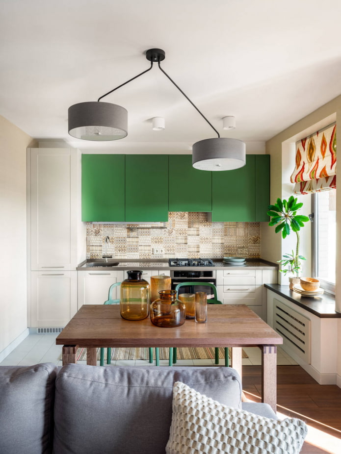
The owners of the apartment are travel enthusiasts, and they tried to reflect their passion in the interior. The old kitchen was not attractive, so it was completely dismantled and attached to the living room.
As an apron, tiles with ethnic ornaments were used. Its shade harmoniously resonates with the color of the dining table, beige walls and rug. The kitchen, according to the latest fashion, is two-tone.
The situation turned out to be modern, but with vivid details that give it an identity.
These stories prove that even a small kitchen area is not an obstacle to creating a convenient, beautiful and cozy space.


 How to choose the color of the sink for the kitchen?
 White kitchen: features of choice, combination, 70 photos in the interior
 Black suite in the interior of the kitchen: design, choice of wallpaper, 90 photos
 Modern design ideas for curtains for the kitchen - we make out the window stylish and practical
 Wallpaper design: 65 photos and ideas for a modern interior
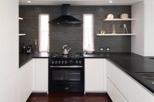 Design of a white kitchen with a black countertop: 80 best ideas, photos in the interior