How to choose a color?
The design of the room depends on the taste of its owner, but you need to learn how to correctly combine several colors in the interior of the kitchen.
Basic rules
To begin, we recommend that you listen to useful tips from modern designers:
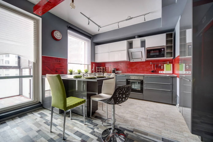
- The main thing that should be guided in the selection of colors for the kitchen is the rule of three colors. For background usedominant tone and its shades, it should be 60% of the space: in the decoration or color of furniture - it all depends on the area of the kitchen. Most often, the dominant tone is chosen neutral. It is against his background that he looks good additional color, which is 30%, as well as the main accent shade (10%). A bright accent should stand out and attract attention: it can be an apron, table, chairs or decor.
- Each shade carries its own associations and impressions. One kitchen of soothing colors will seem boring and pale, while others - soothing and relaxing. Light colors expand the space, slightly blurring the boundaries, and do not attract too much attention. Contrasting, saturated in color objects, on the contrary, "creep out" forward and seem larger. The following rule follows from this:
- The larger the surface area on which the color will be used, the less catchy it should be. Bright, rich kitchen sets have already gone out of fashion, therefore, choosing furniture "for centuries", it is worth listening to the opinion of experts.
Choose a color in Feng Shui
Consider the favorable colors for the kitchen in terms of Feng Shui.
To achieve harmony with oneself and others, universal pastel shades are suitable: white, beige, light green and muted yellow. To avoid a "conflict of the elements" you should not use black and dark blue tones on the south side, and metallic on the east. At the same time, in the northern and western rooms you can apply bright colors - orange, yellow and scarlet - to "dilute" the negative flows of Yin energy coming from these sides.
However, these tips are useful only to adherents of ancient Chinese teachings.
In the photo there is an ideal Feng Shui cuisine - in pastel and wood shades with bright accents in the form of curtains.
Psychology of the influence of color
It is believed that for a person, not only the associations that determine his attitude to color are important, but also an unconscious reaction to a particular shade. Scientists give their general characteristics that somehow affect our psyche:
| Kitchen color | Human impact |
|---|---|
| Yellow | It improves mood, makes the interior brighter and brighter. Associated with the sun and heat. It sets out to achieve goals, develops imagination, but in large quantities it can lead to overexcitation. He is chosen by positive, talented people. Close shades: lemon, mustard. |
| Green | A symbol of nature, spring, calms and sets to work. Reduces the negative impact of dark colors in the kitchen - black, purple. Prolonged exposure to green can cause distraction. Close shades: pistachio, olive, light green. |
| Red | Close to passionate purposeful natures, red has excessive aggressiveness and at the same time is a symbol of love, activity. For some people it symbolizes danger, so the abundance of scarlet in the interior can be harmful. |
| Orange | One of the best shades for psychotherapy: gives vigor, brings optimism. Symbolizes joy and vitality. Increases appetite. Close shade: terracotta. |
| Blue | It has a special magic, calms, has a beneficial effect on a person. Today it is a very popular color in the interior of the kitchen. He can prompt thought, help focus, and also suppress appetite. Close shades: blue, turquoise. |
| Purple | Controversial, sensual, but can be bright and cocky. Extraordinary people love him. For the dining room, this color is not considered the most suitable - it reduces appetite and can cause anxiety. |
| White | The color of innocence, cleanliness and novelty is a choice that has become a worldwide trend for the kitchen environment. It is used both in small and spacious rooms. Combining with any palette, he inspires new ideas and discoveries. In large volumes, it often causes associations with sterility. |
| The black | Mysterious, strict, respectable. It can symbolize both strength and wealth, and sadness, depression. Black color in the design of the kitchen is chosen by original, confident personalities. |
What colors to make the kitchen?
Today, muted, dusty tones that have replaced the clean, "glossy" range are in fashion. The whiteness of the walls and furniture bored everyone: now designers mix cold white with warm dairy, pink and gray-blue shades.
Cold or warm shades
Cold colors are no less suitable for a kitchen than cozy warm ones. The blue, blue and lilac palette will harmoniously fit into high-tech, Provence, classic and Mediterranean style. But if sunlight rarely peeks into the room, choosing a cold gamut is contraindicated. Also, if there are few windows in it, it is better to arrange the decor in warm shades: orange, yellow, beige and wood. They are suitable for modern style, country and loft.
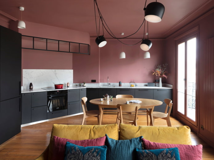
The photo shows a spacious but comfortable kitchen-living room with dark pink walls and a brown floor that echoes the dining group. An additional color is graphite.
Achromatic colors
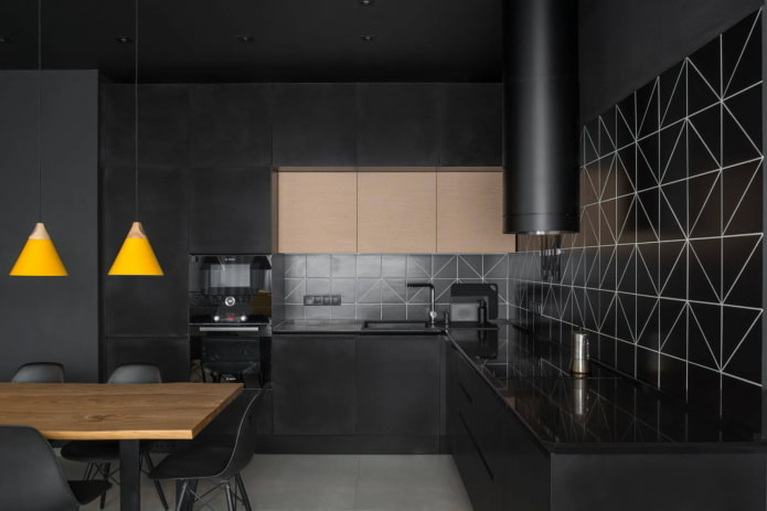
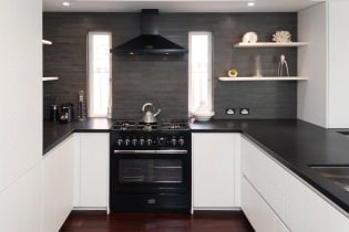
The black and white kitchen interior, as well as the gray color in the kitchen setting, is not an outdated trend. It’s hard to make a mistake with these combinations; moreover, any bright accent can be safely added to the achromatic scale. For Scandinavian style and minimalism, this is the most popular solution.
In the photo, a laconic corner in monochrome. Strictness is diluted with wooden elements - chairs and lamps.
The choice of color around the world
We will tell you which color for the kitchen is better to choose, focusing on the amount of sunlight:
- The kitchen is on the east side. If the windows face east, then the room looks warm only in the morning. Suitable as muffled cold (gray-green, mint, lilac), and warm colors: herbal, orange, lemon.
- The kitchen is on the west side. Light reigns in the room only from the middle of the day until the evening, which means that in the morning the interior needs "warming". Thanks to terracotta, coffee and beige colors, as well as soft shades of red in the morning, the kitchen will seem more comfortable.
- The color of the kitchen is on the north side.The rays of the sun are almost elusive here, so it is better to decorate the atmosphere in creamy, cream, light yellow, as well as warm green shades. Saturated scarlet and orange accents will be very welcome here.
- Coloring on the south side. If the windows face south, then the room in summer is flooded with sunlight all day. It can be visually cooled due to white background and blue, turquoiseas well as mint shades.
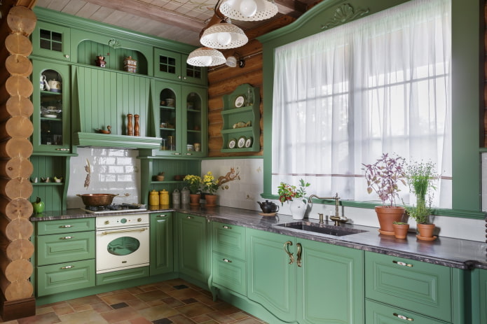
The photo shows a Provence-style kitchen with windows facing the sunny side. On hot days, a muted green color brings freshness to the atmosphere.
In the summer, warm colors in the kitchen, flooded by the sun, will only increase the sensation of heat, but at any other time it will look at home cozy and elegant.
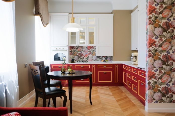
The photo shows a neoclassical kitchen with coral-colored cabinets and a floral accent.As you can see, the red color on the north side makes the atmosphere of the kitchen much warmer.
Features of the choice of kitchen area
The color scheme of a room largely depends on its size. But does this mean that on a large area we can give free rein to imagination, and a compact kitchen must be white?
Color solutions for small kitchens
A small room is not a sentence. Despite the fact that it is necessary to think through every detail in it, absolutely any color can be entered into the interior. Do not be afraid of dark shades. The only limitation is that they should not be dominant, especially on the ceiling, otherwise we will get the effect of a “closed box”. Gray, chocolate and black tones are recommended for use on the floor and at the bottom of the headset.
Recently, designers like to combine light wood with blue, pink and mint shades. They do not overload the space and play favorably on a combination of natural materials with delicate tones.
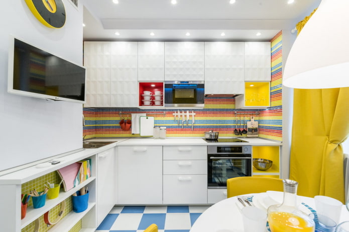
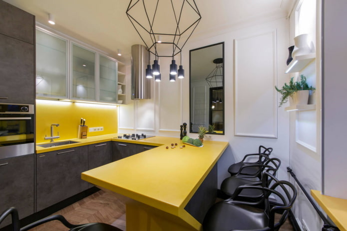
In the photo there is a small kitchen with a gray bottom, a yellow countertop and an apron. The rich color for a small kitchen is a great way to divert attention from its size.
Snow-white interiors with color inserts remain traditional. If you use beige color in combination with white, the kitchen will look softer, moreover, pastel colors are practical, versatile and never go out of style. And colored accessories can always be replaced if desired.
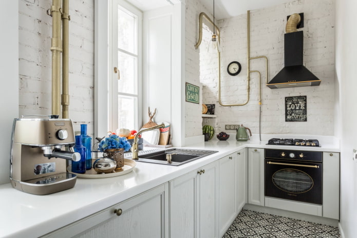
In the photo there is a compact kitchen with loft elements: white brick and pipes painted in gold.
Coloring options for large kitchens
The main difference in the color scheme of the spacious kitchen is the ability to use dark colors as the main ones. Designers Still Love Delicious brown shades - coffee, chocolate, caramel, trying to avoid a boring red shade. The deep color kitchen (indigo, anthracite) in combination with rich yellow elements looks interesting. By the way, black gloss in modern interiors is no longer relevant: it is more correct to choose matte facades of muted graphite shades.
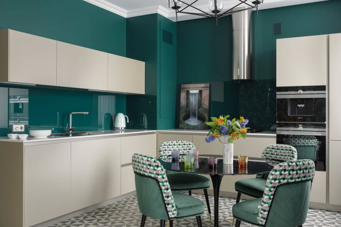
In the photo, the emerald color of the walls gives the impression of a stylish, expensive and respectable kitchen.
Light interiors with bright or dark contrasting accents are no less popular. Gray color in the design of the kitchen suitable for those who find it difficult to work with the palette: it will serve as a great backdrop for your favorite additional shade.
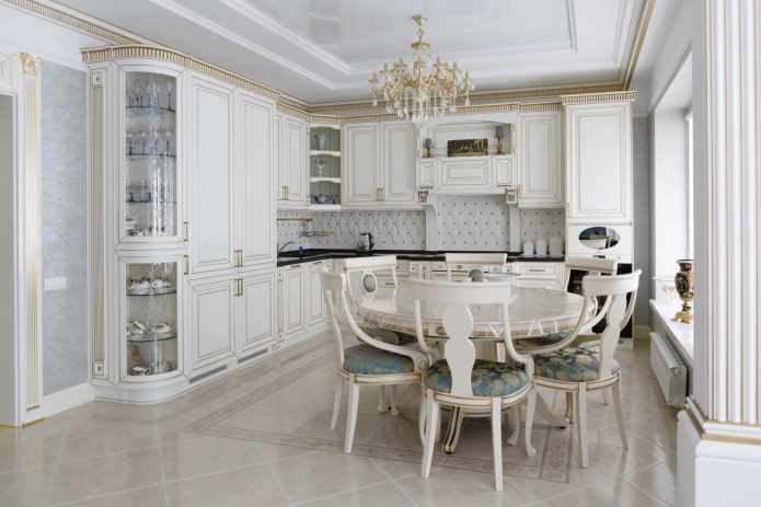
In many countries, white is still the leader. Spacious kitchens use both glossy and matte facades. To give the interior warmth, designers advise adding wood elements: countertops, dishes, furniture. However, this advice applies to connoisseurs of the Scandinavian style, but lovers of the classics are more appropriate to add gold, stucco molding and details of muted pastel tones to the atmosphere.
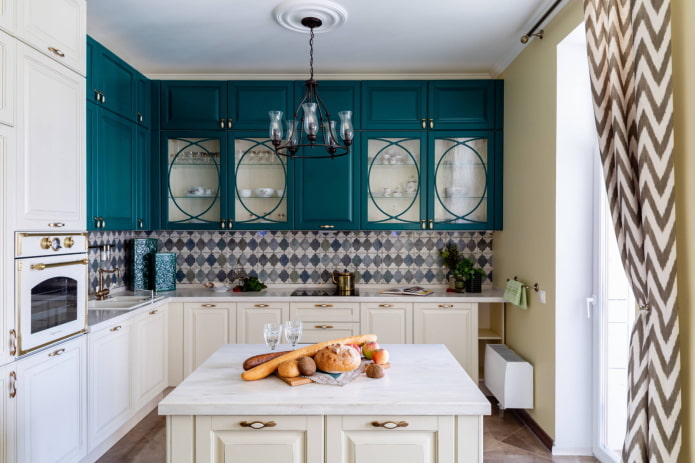
The photo shows dark turquoise facades with glass inserts that make cabinets visually easier.
Photo gallery
Color in the design of the kitchen is the most important component of the interior. Decide on your preferences and familiarize yourself with the rules for combining colors should be at the stage of the design project: then the result will please for many years, gathering family and guests at the same table.


 How to choose the color of the sink for the kitchen?
 White kitchen: features of choice, combination, 70 photos in the interior
 Black suite in the interior of the kitchen: design, choice of wallpaper, 90 photos
 Modern design ideas for curtains for the kitchen - we make out the window stylish and practical
 Wallpaper design: 65 photos and ideas for a modern interior
 Design of a white kitchen with a black countertop: 80 best ideas, photos in the interior