Wall Cabinets
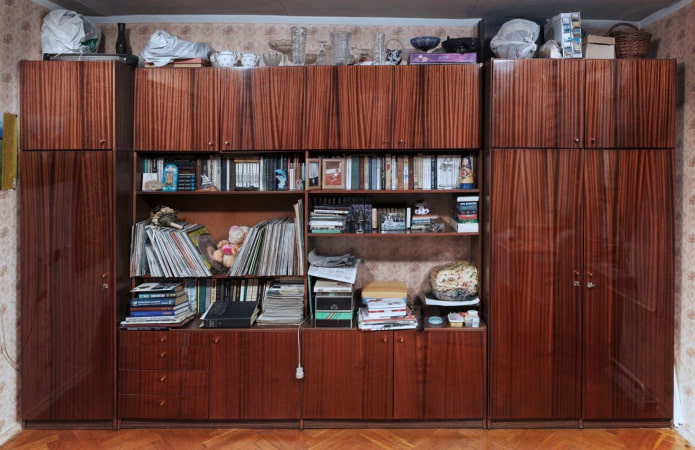
The Soviet “walls” have long lost their relevance, but some people still cannot refuse such a bulky storage system. What is the minus of such furniture? Massive cabinets of an unnatural dark brown color visually poison the interior, eating almost half of the valuable space. Many argue that the "walls" are very spacious, and therefore indispensable, but is it really necessary to store a huge number of objects in the house?
Psychologists have long established that by tumbling his apartment, a person is freed not only from obsolete things, but also from negative thoughts, freeing up space both in his beloved house and in his head. If the budget does not allow replacing the furniture with a new one, you can simply disassemble the wall and, leaving part of the cabinets, repaint them in a lighter color. Today, remaking old furniture is deservedly gaining more and more popularity.
Plasterboard constructions
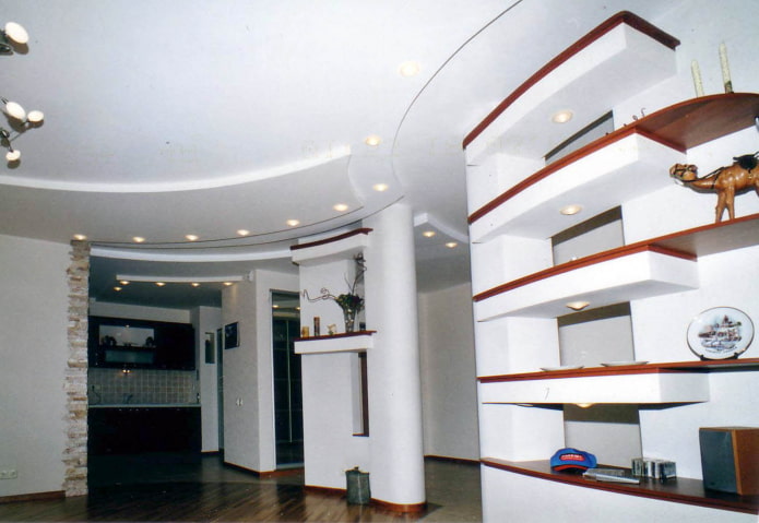
As soon as hyperproc appeared on the construction market and became available, many designers began to demonstrate its capabilities by constructing unthinkable partitions, arches, multi-level ceilings and niches. Today, the world is striving for minimalism. Modern experts no longer recommend overloading space with drywall compositions that do not carry any function other than decorative. Creating such a design, a person immediately turns his new interior into an outdated one.
Printed wallpaper throughout the room
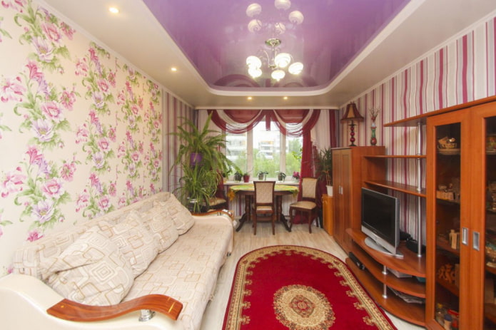
A large or small pattern on the wallpaper with which the whole room is pasted visually overloads the interior, creating a visual noise. Neither designer furniture, nor perfect order, nor thoughtful lighting can save him. This is especially unattractive if the ornament is contrasting. Wallpaper over the entire area of the walls automatically makes the atmosphere old-fashioned. If you like active wallpapers so much, it is recommended to use them dosed: on a small section of the wall.
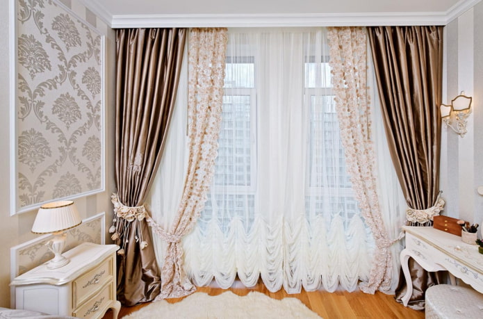
Curtains with lots of details
Another anti-trend in the interior is curtains and tulle with a huge number of folds, quilling and ornaments. Textile stores are interested in the fact that the client purchased a "luxurious" multi-tiered curtains, and better - hired a designer and gave a lot of money for whole compositions with lambrequins and pickups. But in typical apartments, such creations look inappropriate. Instead of an obsolete trend, it is better to give preference to simple concise curtains and roller blinds.
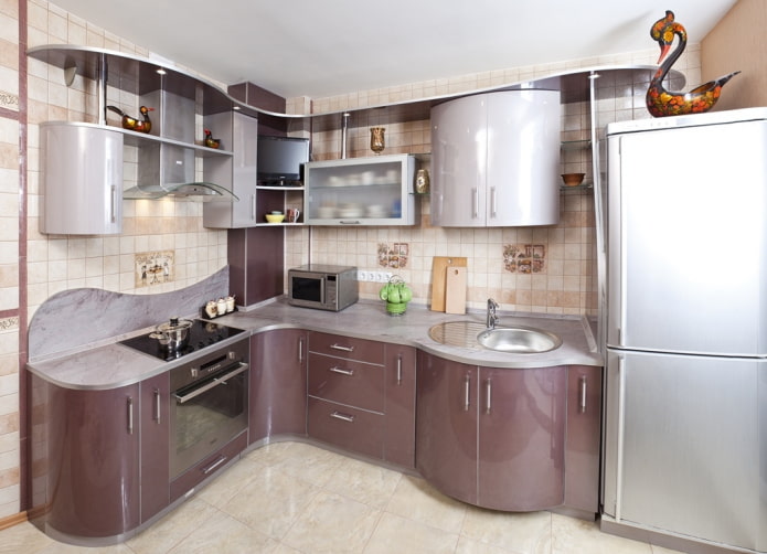
Furniture with rounded corners
Computer tables with flowing lines, radius cabinets for clothes, kitchen sets with curved facades - this furniture became memorable as soon as it appeared on the Russian market, and is still successfully sold.
Rounded countertops can be convenient, but in a modern interior they look old-fashioned and attract too much attention with their appearance. The use of original bent furniture is appropriate only in ultra-high-tech, but to recreate it will require not only a sense of style, but also a considerable budget.
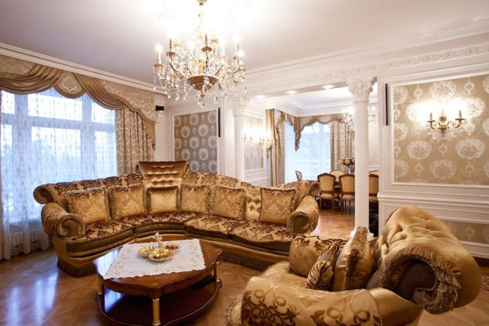
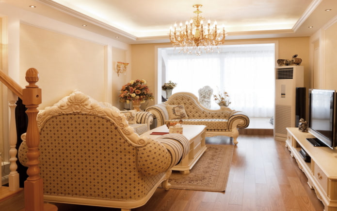
Pseudo-classic
The classical style is strict and canonical; it does not tolerate bad taste and falsehood. But in attempts to stylize their home as a palace interior, many people fail, trying to replace sophistication with a set of fakes.
The furnishings and décor in a classic style are thoughtfulness, restraint and elegance. But the large obsessive carvings on furniture made of chipboard, gilding and shiny synthetic fabrics with outdated ornaments make the interior vulgar.
Photo printing
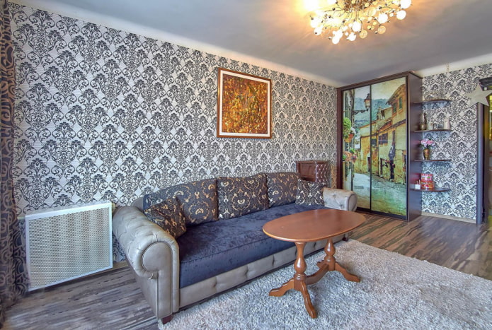
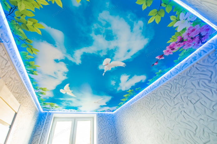
No matter how the manufacturers claim, photo printing on kitchen aprons, the ceiling, cabinet doors and wallpaper almost always looks unaesthetic. The interior, where a significant part of the surface is reserved for the image of flowers, fruits or a night city, looks cheap and intrusive.
Bright banal pictures overload the situation and quickly get bored. But if the desire to decorate your home with a huge pattern is irresistible, it is recommended to choose muted colors, original images and use accent technique in a limited space.
Note that the interior, originally made with taste, cannot be spoiled by antitrends from the past, if they are used on a small area and harmoniously resonate with the whole situation. But to achieve this effect is not easy, so the rejection of these elements will not only benefit your home, but also save the budget.



 Top 10 Trends in Interior Design 2020
 Rating of cheap TVs with Smart-TV
 New Year's LED garlands on AliExpress - we disassemble while it is hot so that the house is bright
 Wall mural with flowers in the interior: living wall decor in your apartment
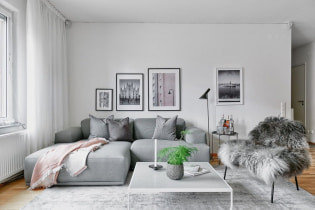 Gray sofa in the interior: views, photos, design, combination with wallpaper, curtains, decor
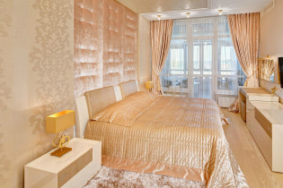 Interior in peach tones: meaning, combination, choice of finishes, furniture, curtains and decor