To create a modular picture, the picture is divided into fragments, each of which is applied to the canvas and pulled on a stretcher. There are no standards here, the canvas can be divided vertically, horizontally, diagonally, “cut” into complex geometric shapes, for example, hexagons. As a rule, these fragments are not inserted into the frames, so as not to impede the integrity of the perception of the drawing in the finished form. The number of parts into which the original image will be divided is not regulated, there can be as many as you like - it all depends on the imagination of the designer and the size of the canvas.
Important: The lines along which the division takes place should match the plot as much as possible, and the individual fragments should look harmonious.
The sizes and shape of fragments can be arbitrarily determined, however, there are general recommendations:
- The side of the fragment should not be less than 30 cm;
- The size depends on the area of the room;
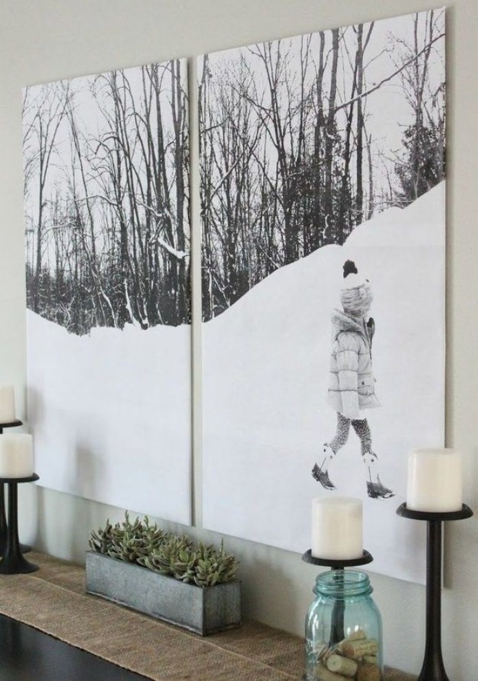
- Common sizes: width from 1.2 to 1.7 m, height - from 0.8 to 1.2 m.
- Typically, the shape of the fragment is a square or rectangle.
The use of modern modular paintings in the interior of the apartment allows you to add dynamism, bring a special “twist”, make the design truly exclusive, appropriate to your character.
Arrangement of modular paintings in the interior
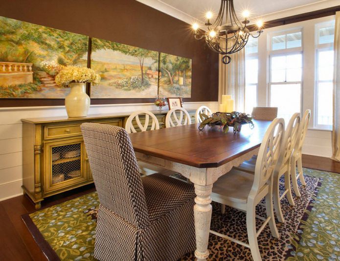
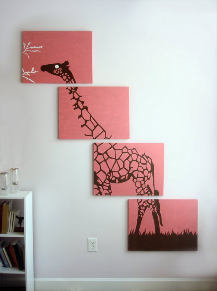
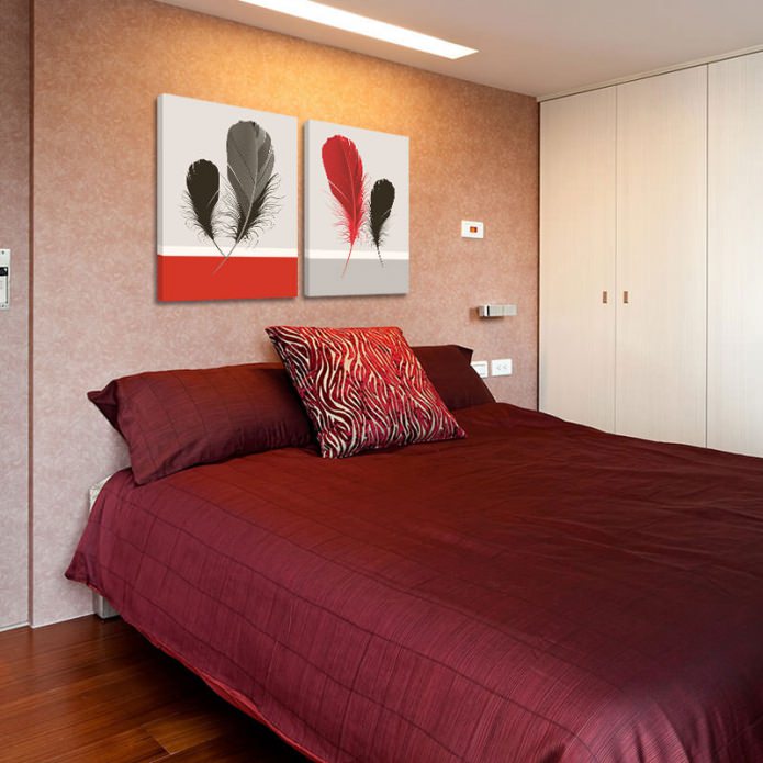
The absence of a frame for each fragment, the presence of “air” between them gives the perception of the canvas dynamism. The following module layouts are distinguished:
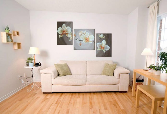
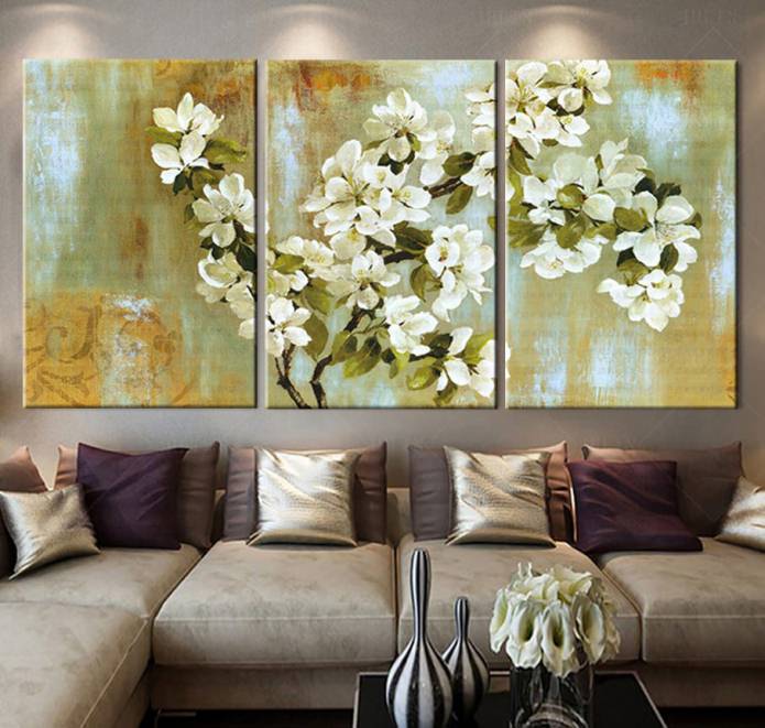
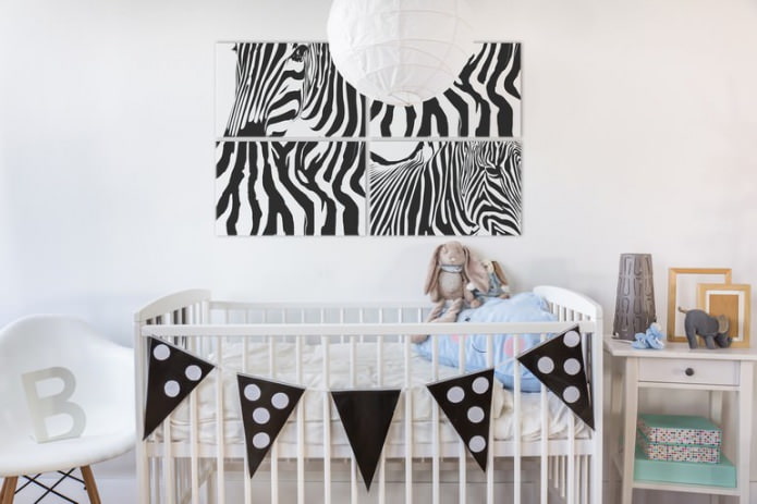
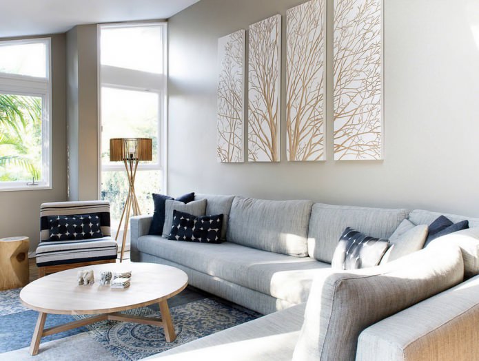
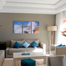
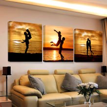
- Standard. The modules are located next to each other, at the same height.
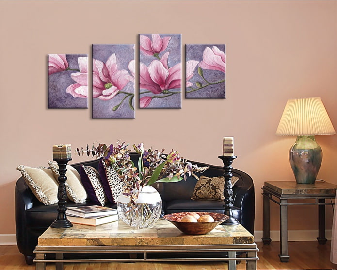
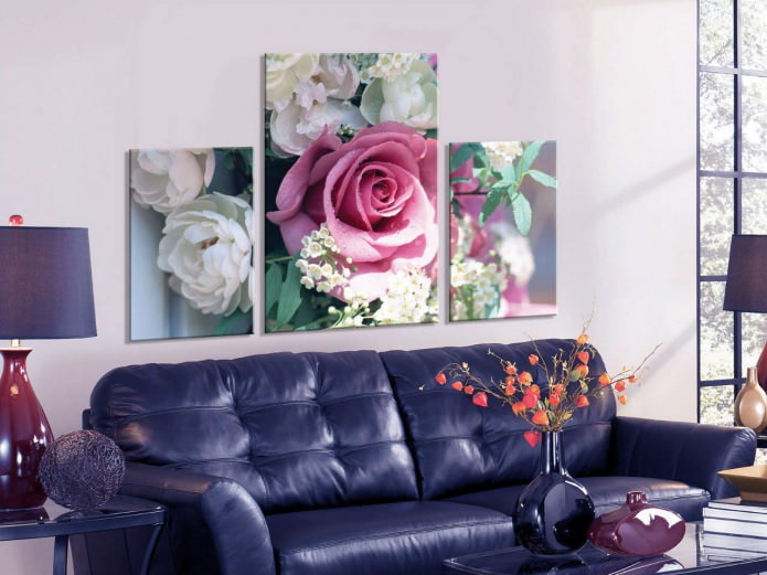
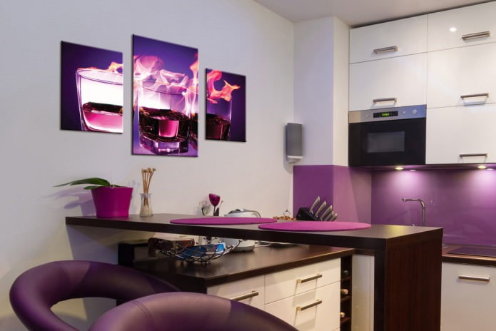
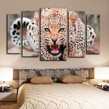
- Popular. The height of the fragments decreases from the center to the edges, the weight - in a straight line passing through the center of the individual parts.
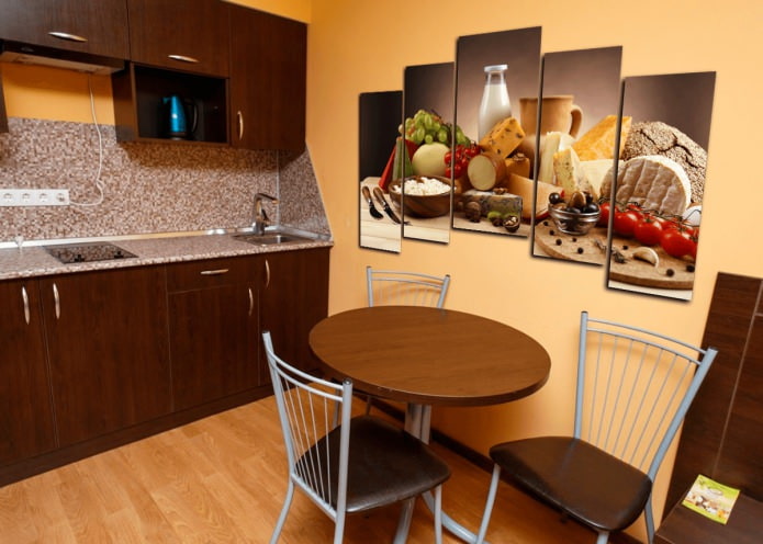
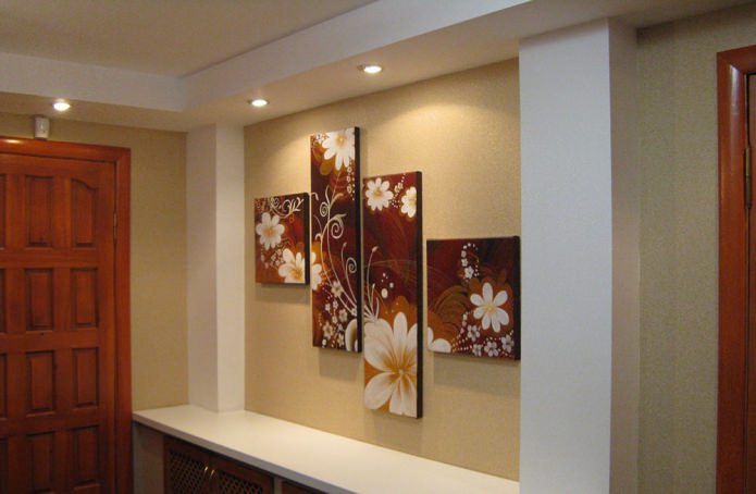
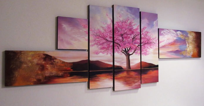
- Staircase. Each subsequent fragment is shifted relative to the previous one, and the shift is performed in two directions: up-right, down-left, etc.
- Diagonal. Modules are hung in a straight line diagonally relative to the floor.
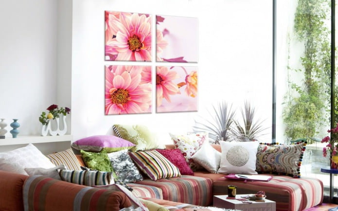
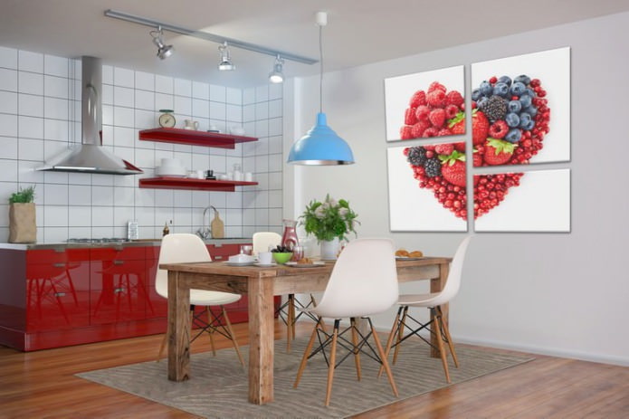
- Geometric Individual segments are assembled into a geometric figure - a square, oval, circle, polygon.
These options all the variety of types of placement of modular paintings in the interior is not limited. It all depends on what decorative effect you want to achieve. The same laws work here as for other types of decoration:
- The vertically elongated compositions visually “raise” the low ceiling;
- A small room will help to increase the horizontally elongated layout of the modules;
- Large, vibrant photographs in a picture can reduce a small room;
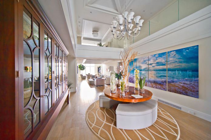
- Panoramic images will create a feeling of spaciousness even in a small room.
Modular paintings in the interior of premises for various purposes
Living room
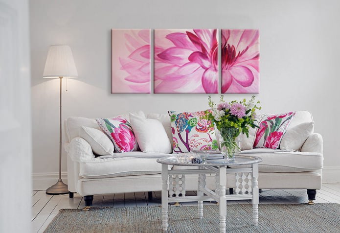
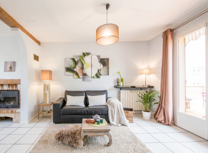
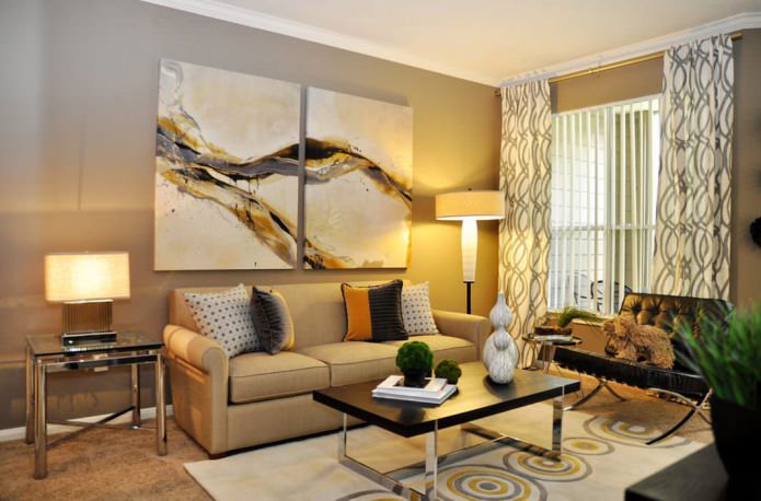
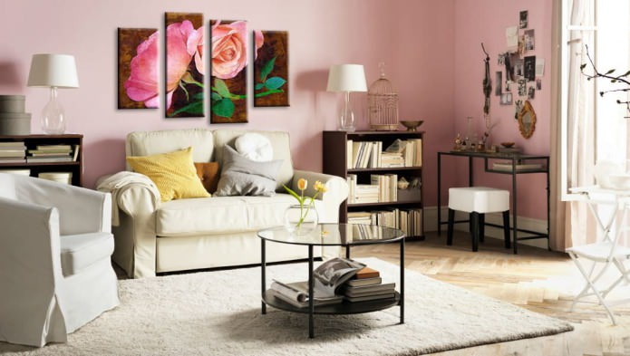
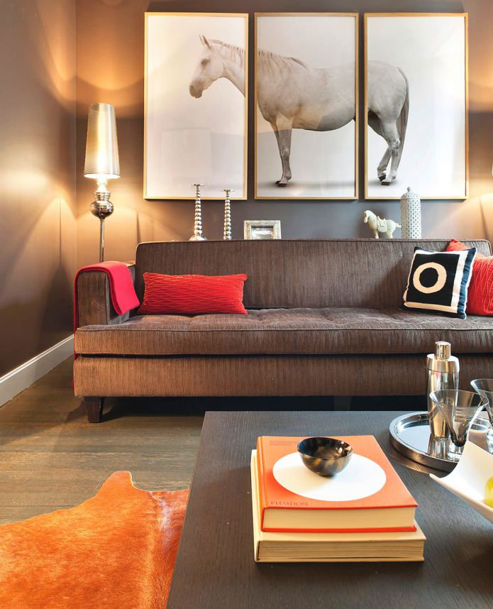
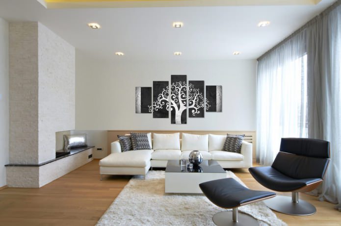
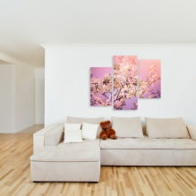
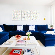
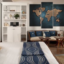
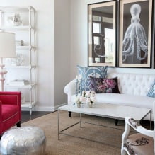
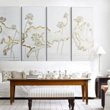
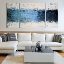
Modular paintings in the interior of the living room can serve as a decorative accent in various areas. For example, a wall by the fireplace, decorated with such a cloth, will attract even more attention to the hearth. If you want to focus on your hospitality, the best place for a modular picture in the interior of the living room is above the sofa.
Try to put a modular picture on a shelf near a decorative fireplace, on a console table or a bookshelf.It will turn out original, especially if you complement the composition with other decorative elements - vases, candles and. etc.
Kitchen
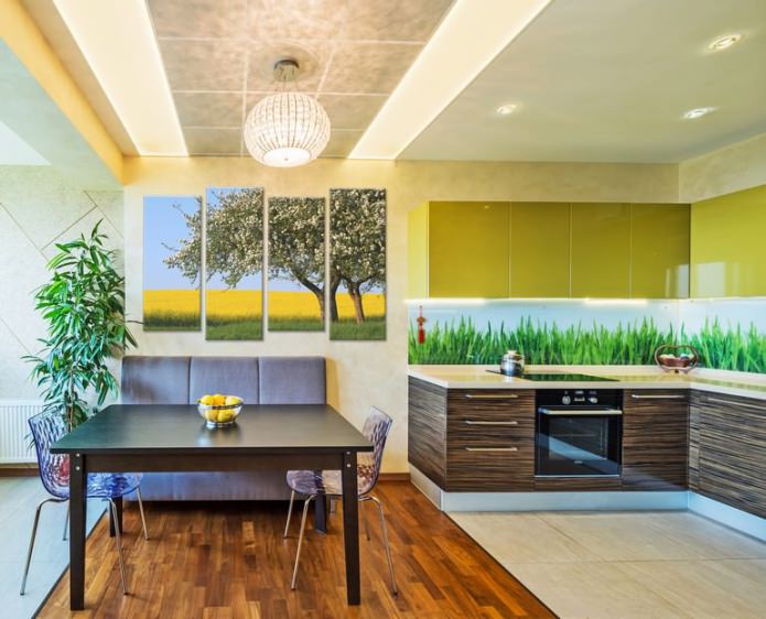
Modular paintings in the interior of the kitchen immediately turn this technological room into an interesting space that reflects the tastes of its owners. The most popular option is photographs of fruits, flowers, prepared meals and drinks. Another way is to introduce exterior elements into the interior. It can be a street with an old cafe or an image of a night city, a seascape or a field overgrown with poppies.
Bedroom
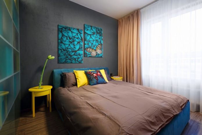
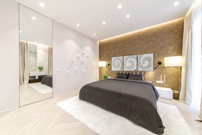
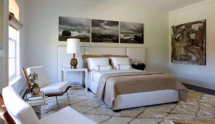
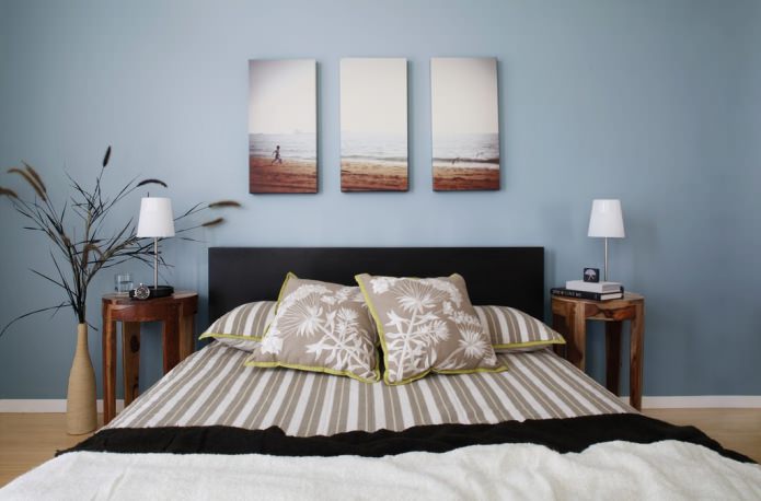
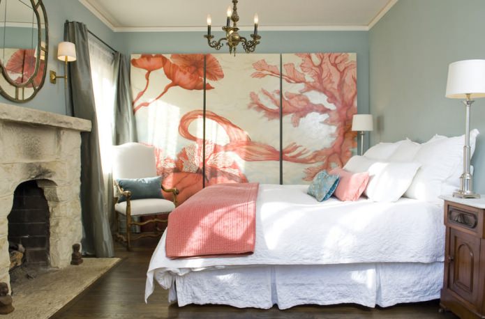
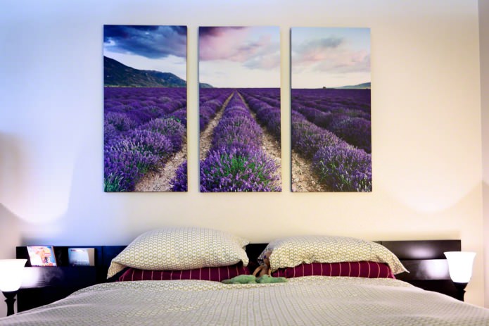
Delicate, pastel colors, romantic plots - these can be modular paintings in the bedroom interior. Blooming fields, individual flowers - orchids, callas, poppies, or lyrical landscapes - these are the most suitable "models" for painting in the bedroom. As a rule, her place is at the head of the bed, although there may be options. Do not place the modules on a wall with a window - you will have to look in the direction “against the light”, and the picture will be poorly visible.
Children
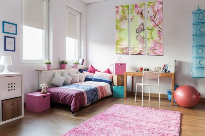
The content of the picture in the nursery depends, first of all, on the age of the child. For very small ones, simple drawings or even parts of the canvas, simply painted in different colors, are suitable. For those older, you can offer paintings depicting scenes from your favorite fairy tales, "cartoon" frames. Teenagers can decorate their room with their own photos, disassembled into segments, or sports scenes.
Entrance area
It is better to hang clear, geometric images that are simple and understandable at first glance - because they do not linger in the entrance area for a long time, and there will be no time to consider the picture. Graphics are a great choice for a minimalist room, a flowering meadow is for a country-style hallway.
Design rules for modular paintings in the interior
Follow the advice of specialists so that your paintings “play” with all the colors and decorate your interior.
- Too active colors are inappropriate in rooms intended for rest and relaxation.
- If the room is small in size, a plot with photos of mountain landscapes and views that include a horizon line will help to create a feeling of large space.
- Relate the size of the painting to the area of the wall on which it will hang. The larger the wall, the larger the size of the individual segments and the picture as a whole, and vice versa.
Tip: Before you drive picture hooks into the wall, use sticky stickers to mark the locations for each segment and evaluate how they will look. Sticking stickers to a new place is easier than hanging pictures.
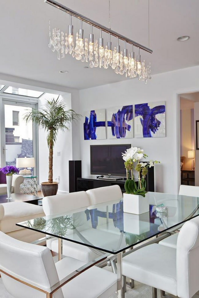
- The size of the picture should be related to the size of the furniture. It is good if its width is 25% less than the width of the decor item over which it hangs.
- Drawing on the genre should match the style of the interior. Exceptions are allowed, but should be well thought out. For example, in a minimalist style kitchen, both an abstract canvas and a rural landscape will look appropriate.
Important: When hanging pictures, keep in mind that its center should be placed at eye level of the beholder. For a standing person, this is approximately 160 cm, for a person sitting on a sofa - 110 - 120 cm. If the picture is elongated in height, then the level is counted not in the center, but from the upper third.
Modern modular paintings in the interior: photo
Here are some examples of how modular paintings (photos in the interior) can change the space:
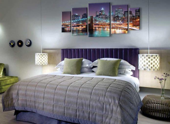
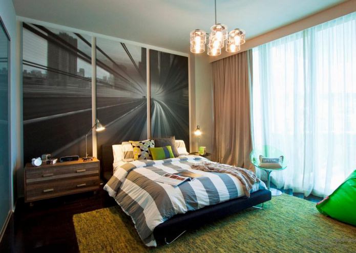
Photo 1. Add dynamism with the image of the city highway on a modular picture in the interior of the bedroom.
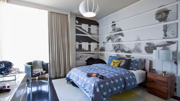
Photo 2. A children's room for a teenager will be decorated with a picture with a sports theme.
Photo 3. The image of juicy berries or fruits is the most suitable topic for modular paintings in the interior of the kitchen.
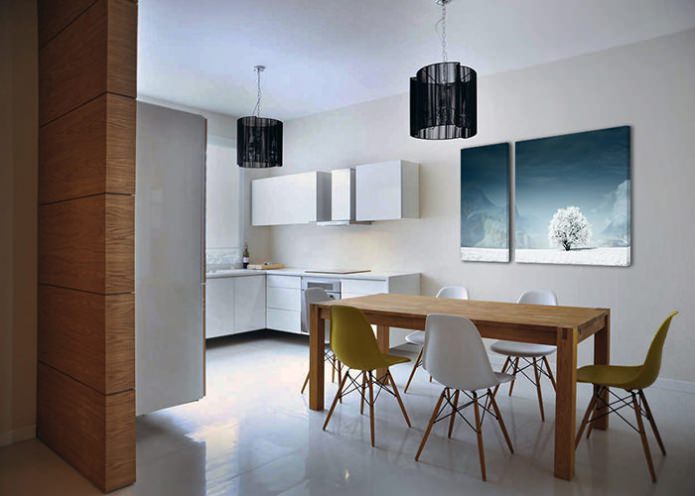
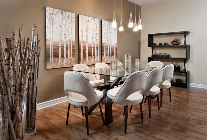
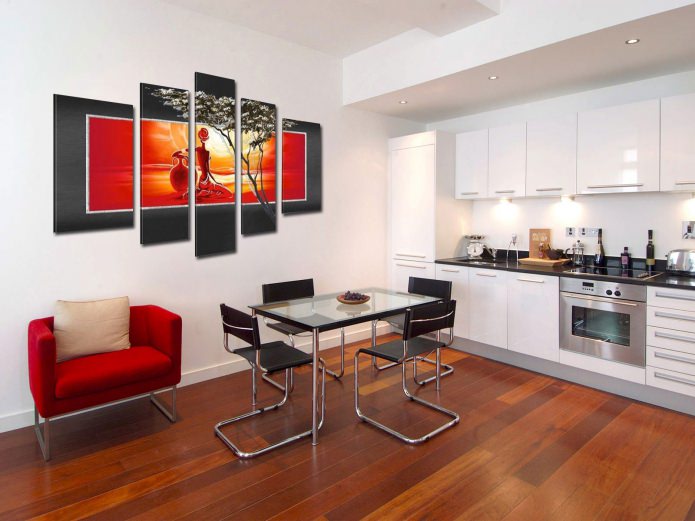
Photo 4. The tree depicted on the modules gives the modern interior a traditional and solid look.
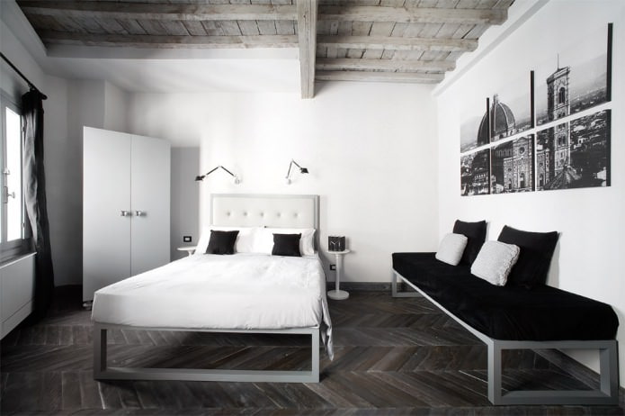
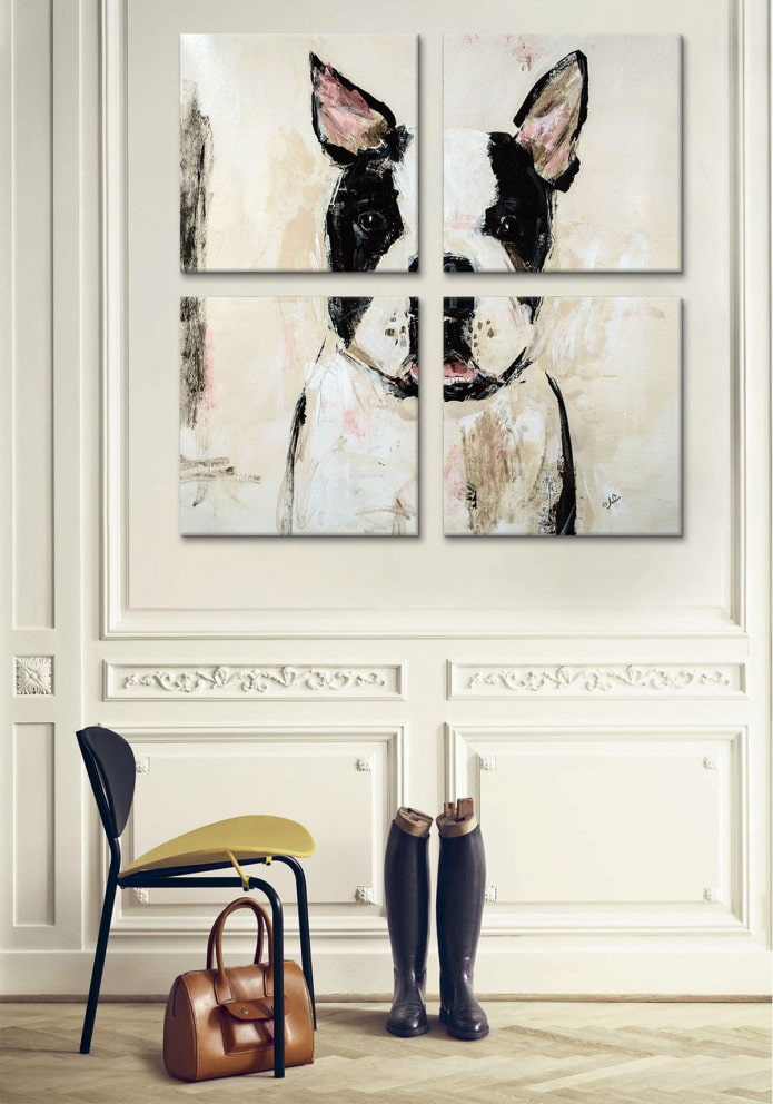
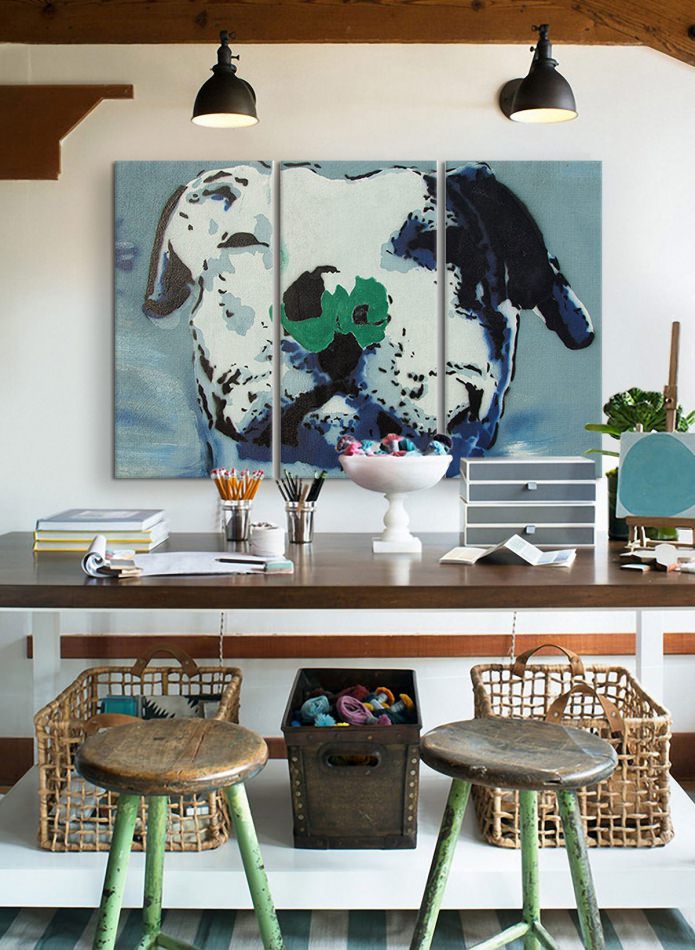
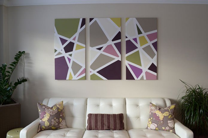
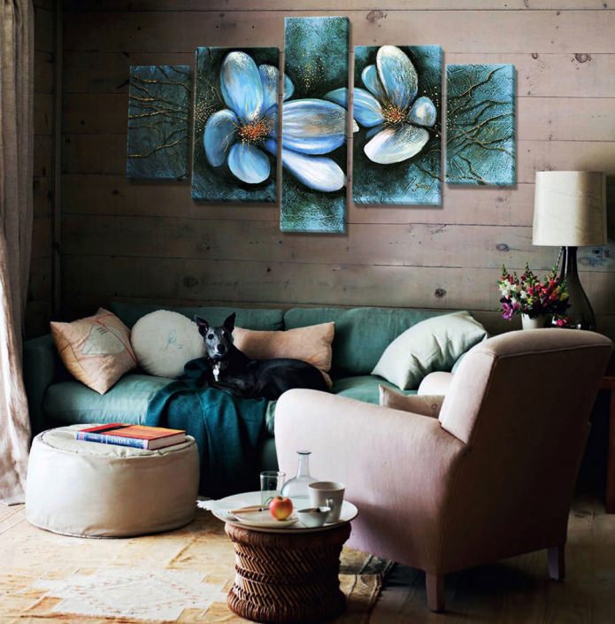
Photo 5. The picture can be divided into any number of modules, and their position in space can also be unconventional.
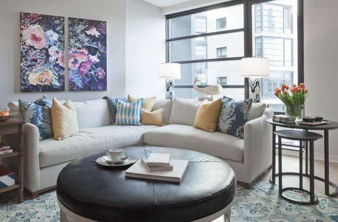
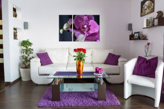
Photo 6. Bright purple flowers in the picture, pillows and carpet became the main decorative accents of the room.
Photo 7. The images in the modular picture overlap in color with a decorative bedspread and pillows in the bedroom.



 Top 10 Trends in Interior Design 2020
 Rating of cheap TVs with Smart-TV
 New Year's LED garlands on AliExpress - we disassemble while it is hot so that the house is bright
 Wall mural with flowers in the interior: living wall decor in your apartment
 Gray sofa in the interior: views, photos, design, combination with wallpaper, curtains, decor
 Interior in peach tones: meaning, combination, choice of finishes, furniture, curtains and decor